Atlas is a search platform designed for recruiters to discover, evaluate, and connect with candidates across a centralized system. I joined the team as a product design contributor to help implement new feature enhancements—primarily focused on dashboard customization and layout flexibility. The platform was already built and in use, so my work involved extending existing designs and functionality through collaborative iteration with the product and development teams.
While the core platform was functional, recruiters needed more control over how information was displayed and interacted with. The existing dashboard was static and didn’t support personalization, or certain selection mechanisms, which created friction in day-to-day use. My role was to help rethink how recruiters could shape their workspace to better match their individual workflows.
The two features I focused on were:

Since I was brought in after another designer had worked on this, I needed to familarize myself with the experience. Without spending too much time on the platform and each capability within it, I focused primarily on the sections and tasks at hand.

I also needed some inpsiration. I thought about what platforms work similarly as to what we are building out on Atlas. Some of the inspiration I found were things similar to Gmail, or Outlook, where you can interact with various sections of platform individually. Other examples like this where you can collapse full sides and reopen as the user needs. I also thought about experiences with system preferences or settings where the user can personalize their experience.

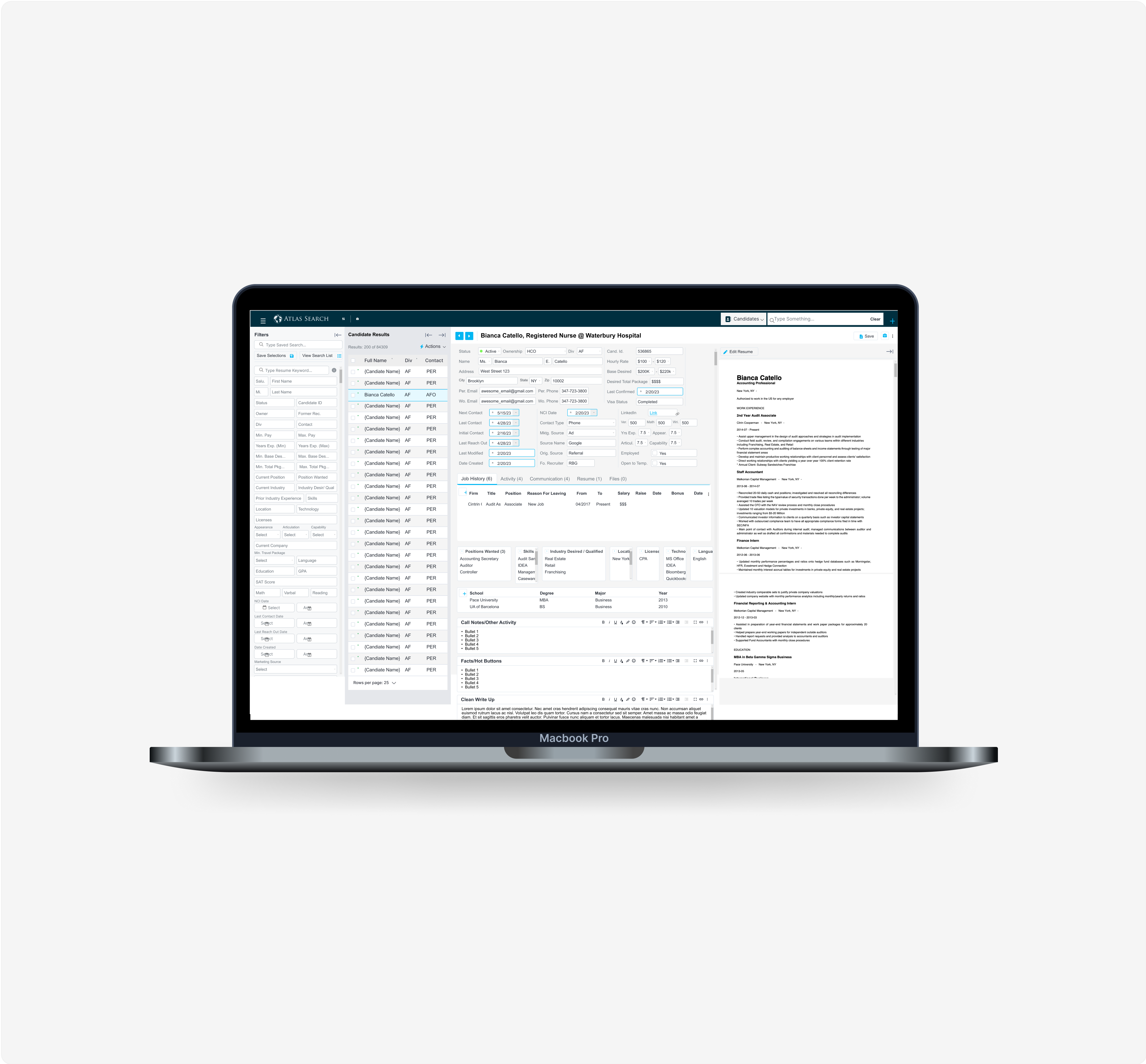
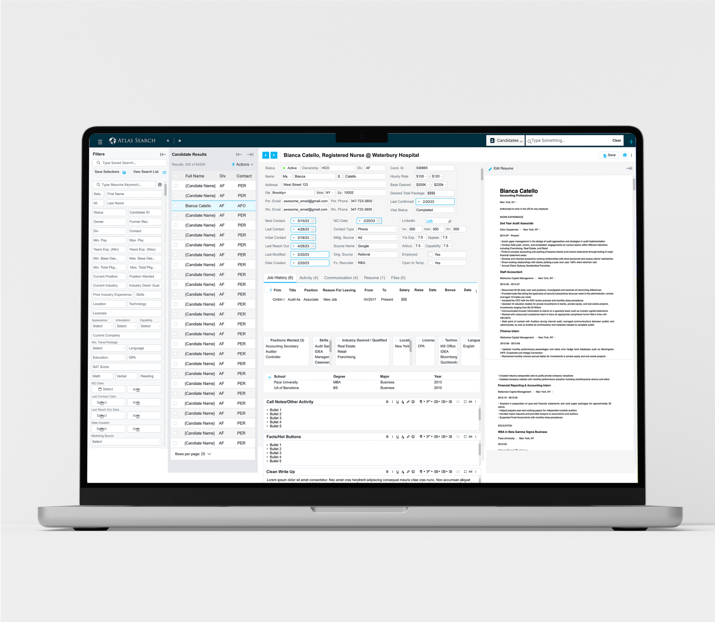
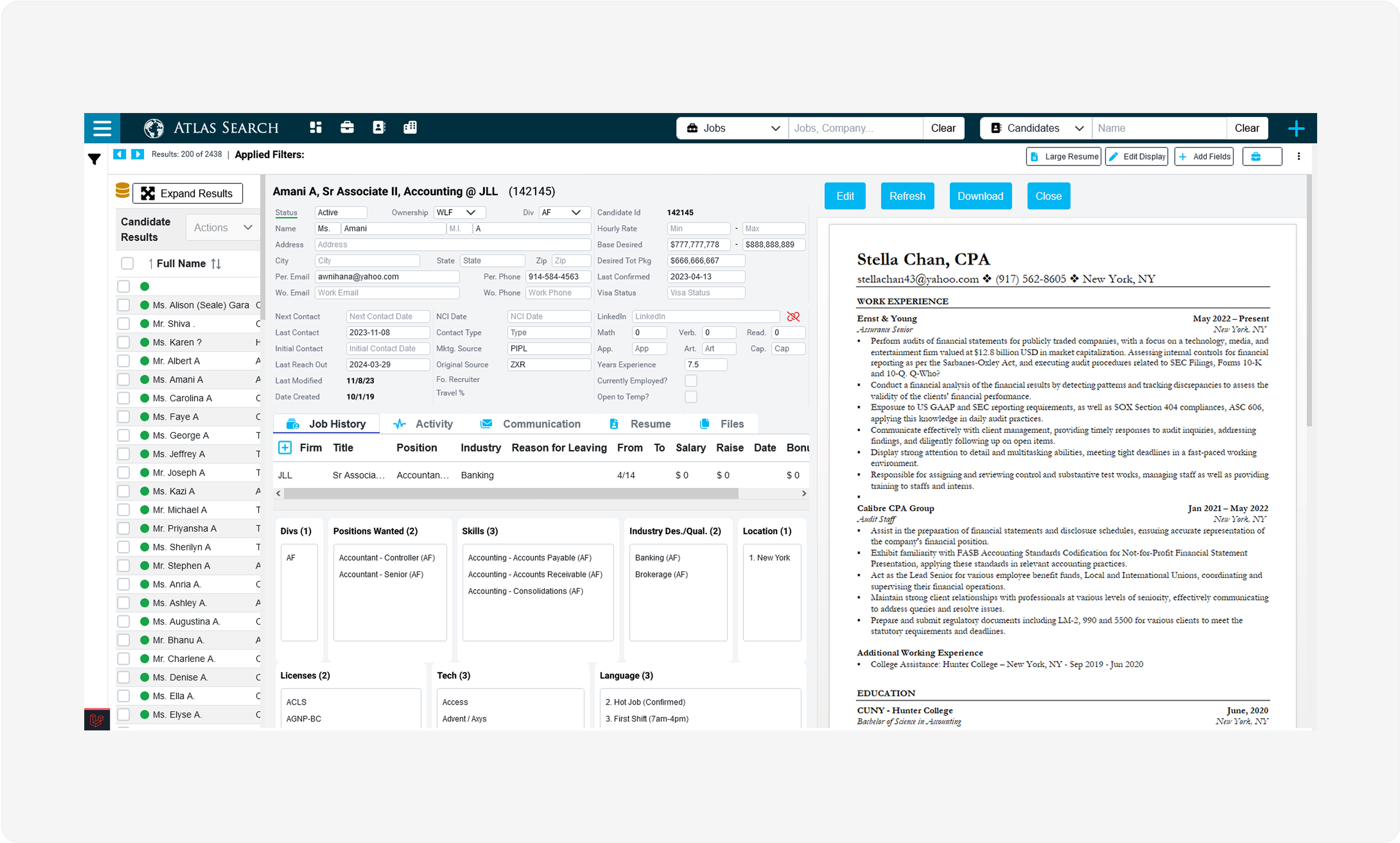
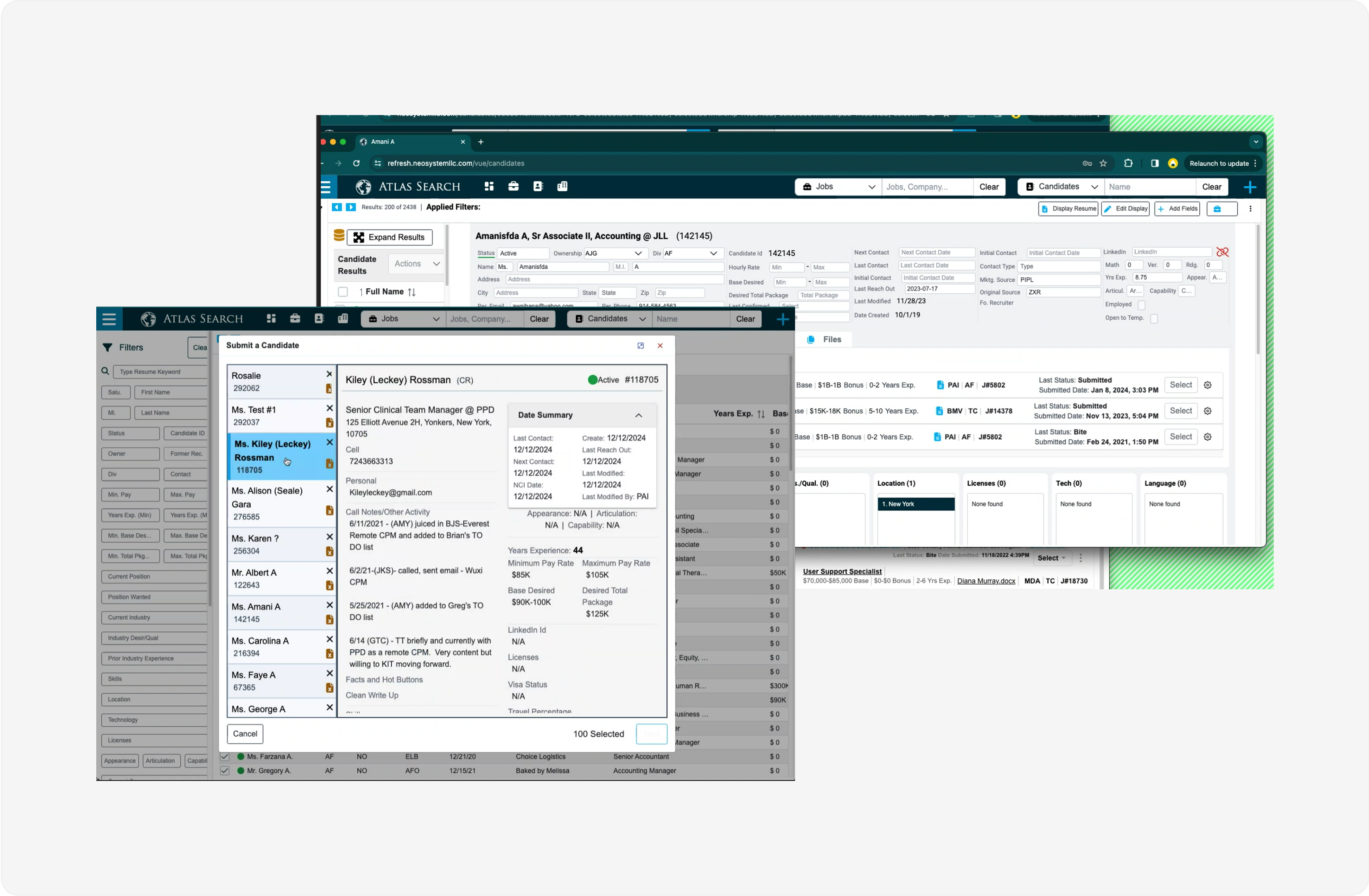
Recruiters needed a way to tailor the information hierarchy on their dashboards—some preferred to see resumes first, others prioritized education or work history. My task was to design an intuitive editing mechanism that allowed users to control the order of sections in a way that felt natural and non-disruptive. However, user roles was also a factor here and we needed to accommodate for a team lead making edits for a full group of recruiters. After several internal review sessions, we landed on a streamlined editing model that gave users meaningful control without overcomplicating the experience.
Another priority was enabling users to toggle visibility of dashboard sections. For example, recruiters might want to collapse the left-hand candidate list or minimize a right-side panel to focus on central profile details. I explored multiple layout states; collapsed, expanded, hybrid; and mapped out how each would behave. I started with basic wireframes and then went into design. These iterations were shared with the dev team to ensure technical feasibility and led to a more adaptable, task-oriented interface for users working across different contexts.
This was a focused, collaborative project that gave me space to ideate within an existing system and support the team with thoughtful, user-focused feature improvements. I enjoyed working closely with both the product and dev teams, and the work reinforced the value of small UI shifts in driving clarity and control in recruiter workflows.