
In simple terms, Basa needed a number of new features built out that clients were relying on as part of the platform experience.
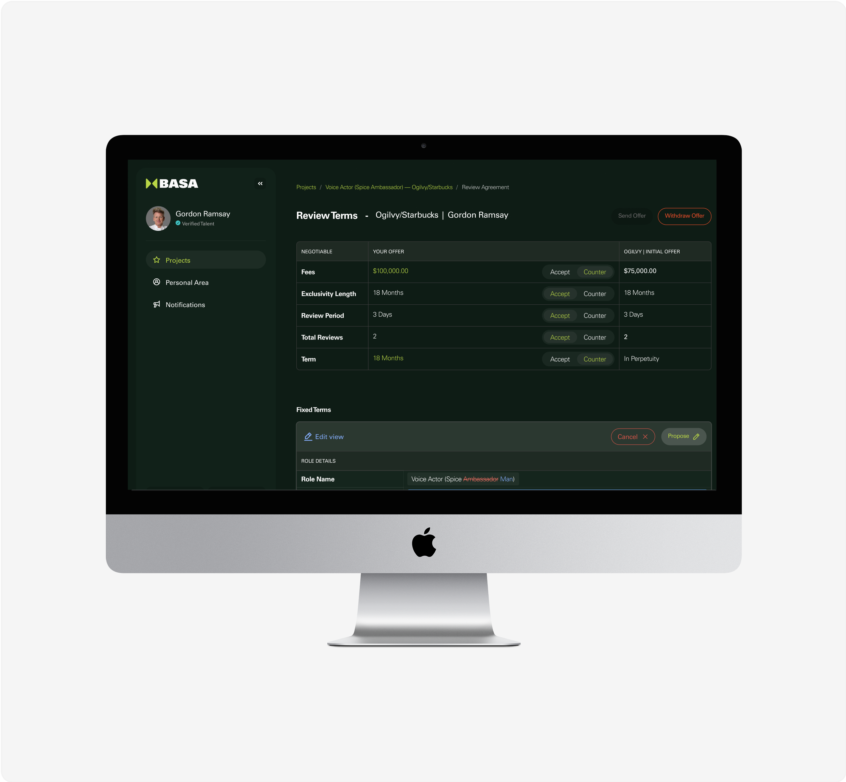
Basa is an influencer marketing platform, focusing first on the impact of contract negotiations and how we can make this experience a seamless two way street, all on one platform. For example, influencers themselves or their managers, and the client, can accept, decline, counter, and sign contracts, all on Basa.
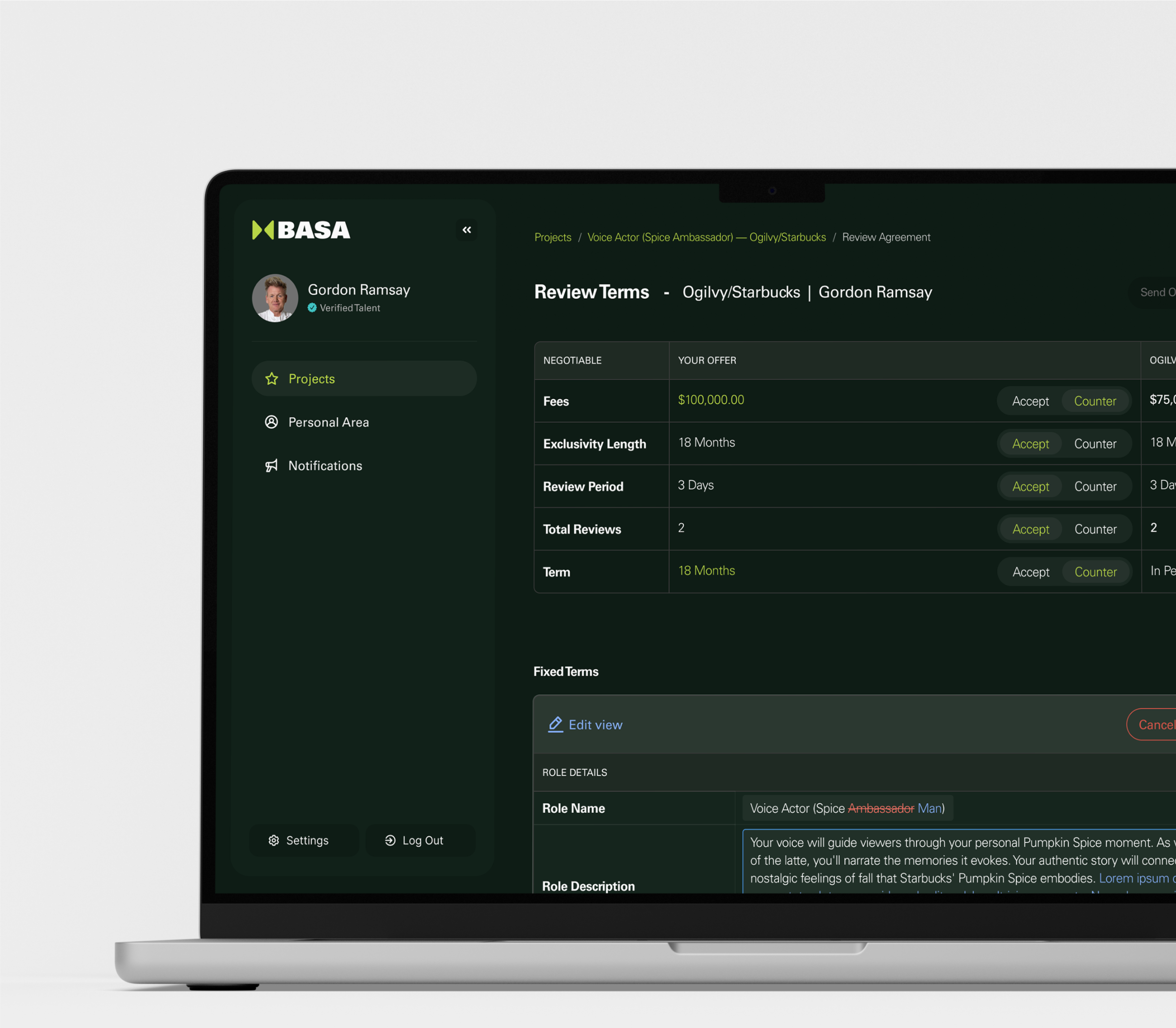
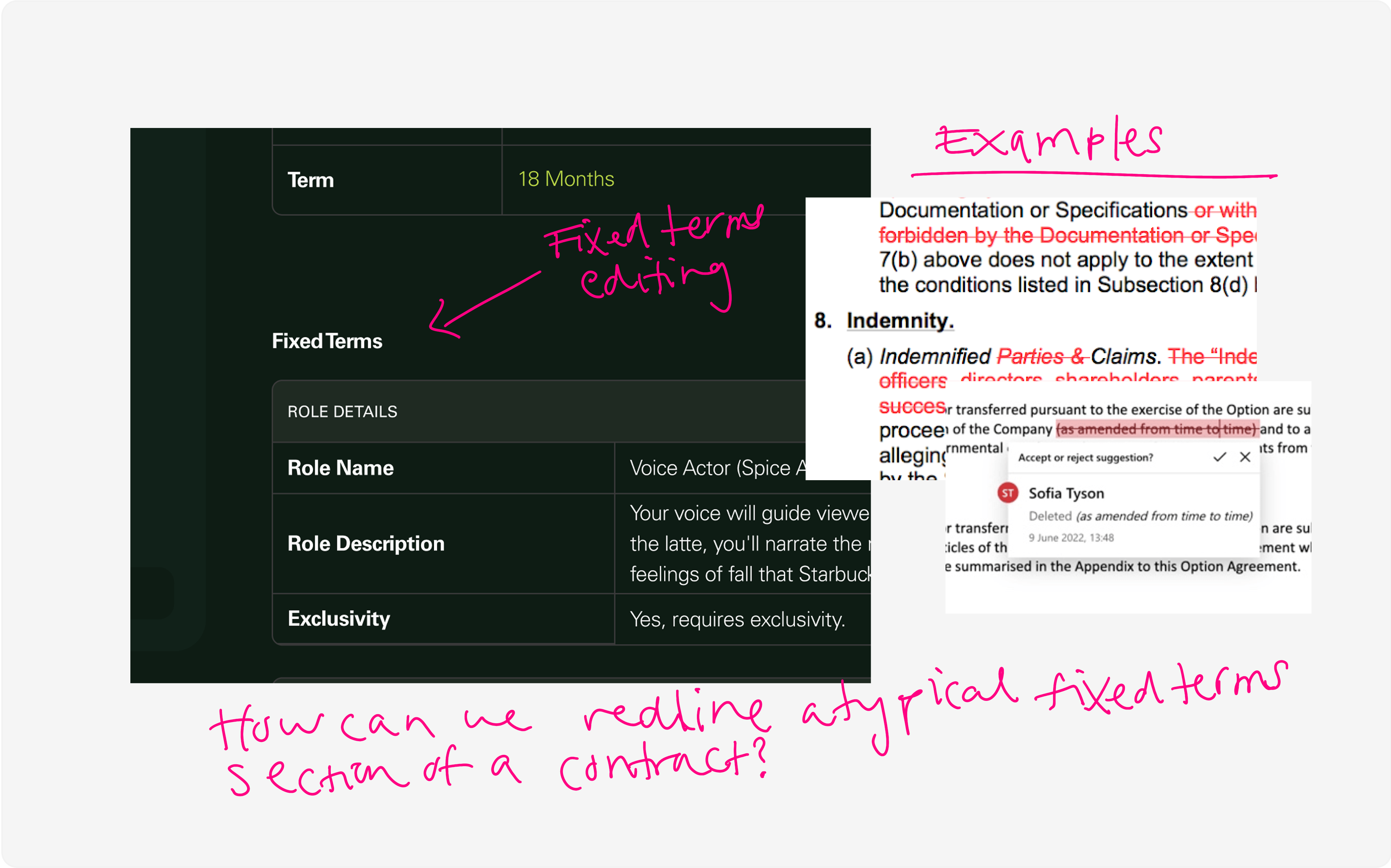
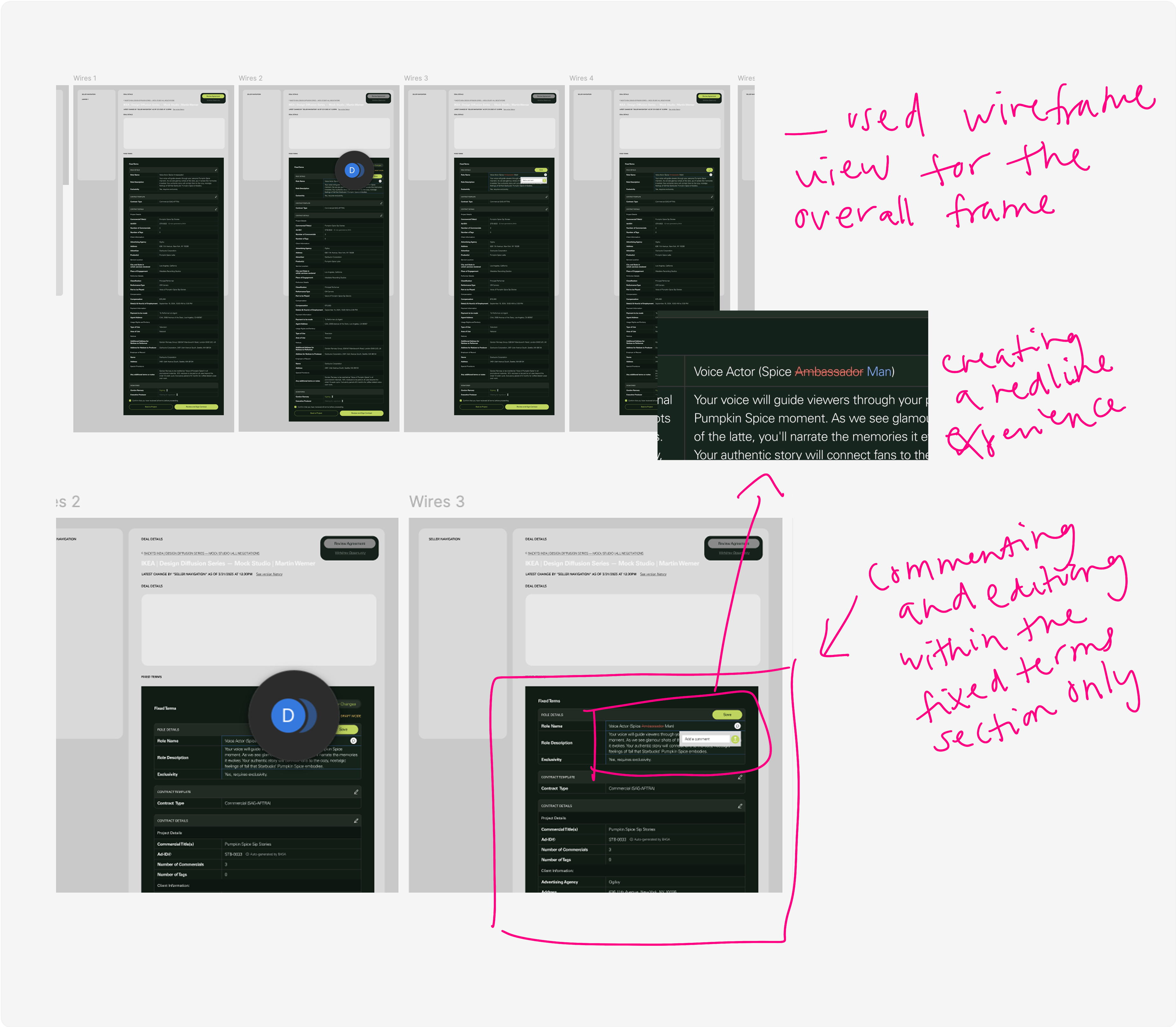
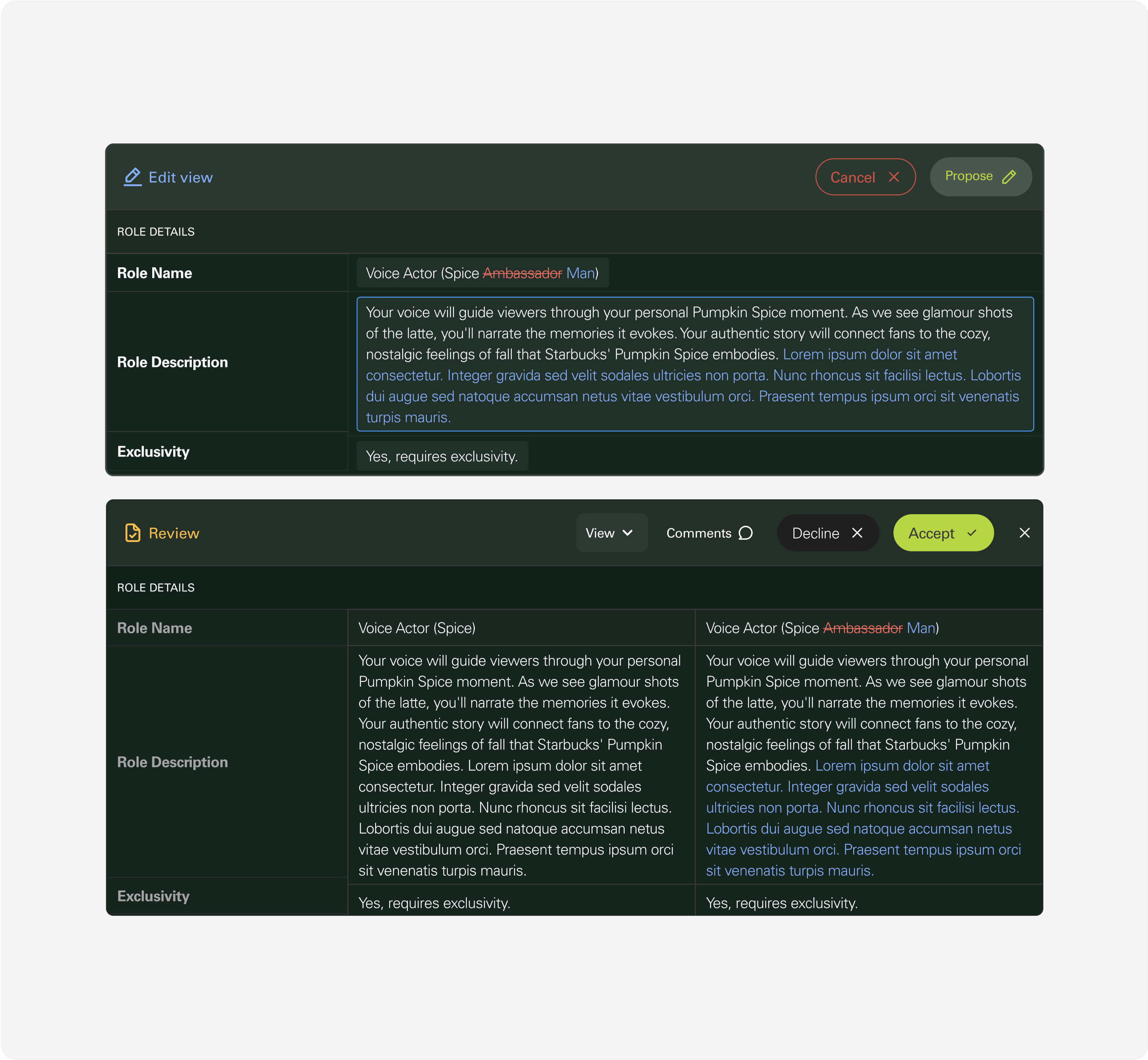
As a start up, Basa didn’t have a big team on deck to work on the different needs from clients and stakeholders. The CEO had compiled a list of feedback that needed implementation. The first problem I tackled was creating a way to edit or red-line the fixed terms of a contract, just like a lawyer would do, right there on the Basa platform.
The first two most important things needed were the following:
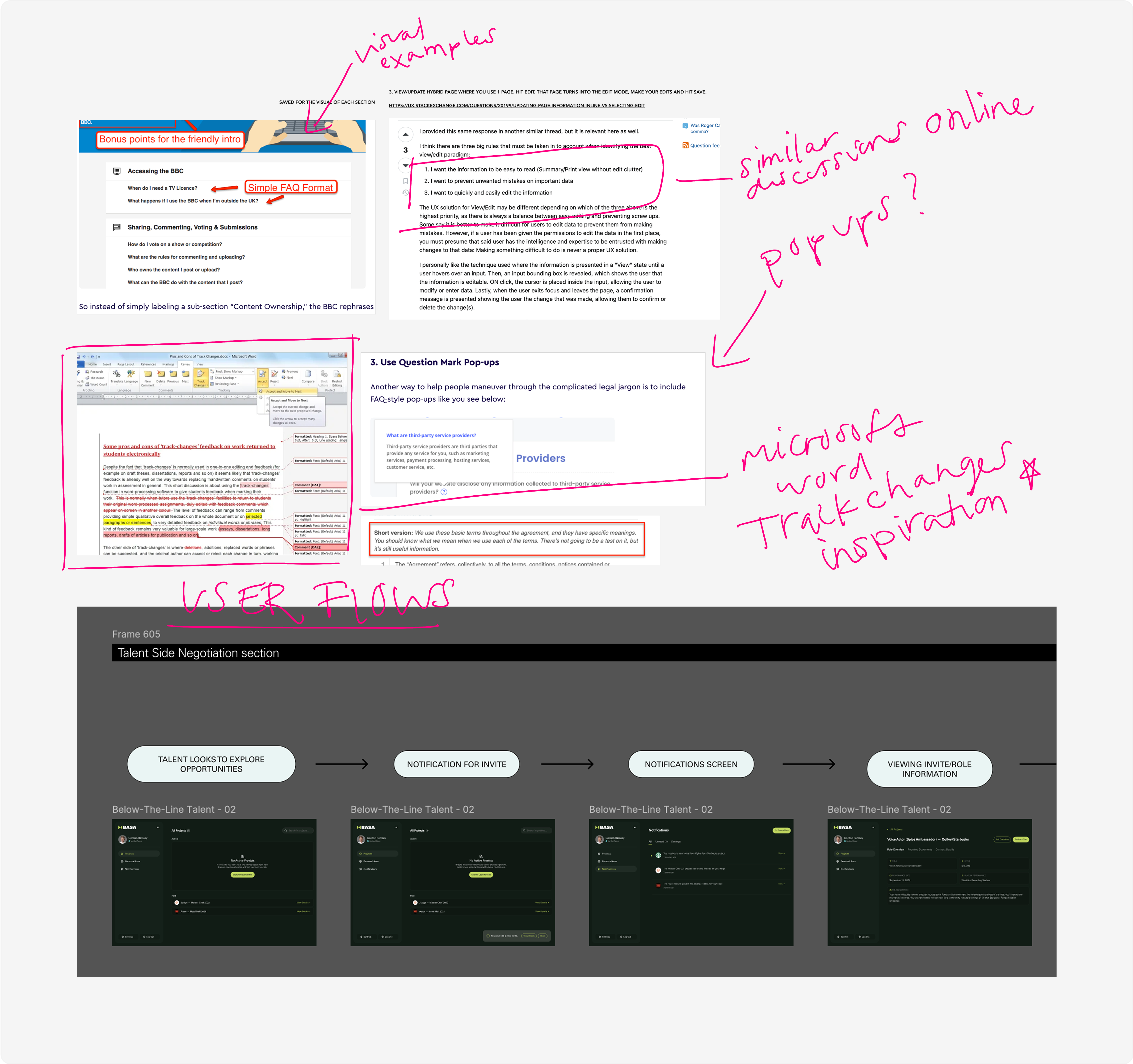
The team did not have clear user flows prior to my joining the team, so the beggining part of this feature build focused on drawing out the user flows and understanding each touch point for the user, what CTA's were doing what and why each screen was important.
Thinking about the flows and specifically:
At what point is the user going to even have the opportunity to edit these terms? What steps come before it or after it?
The wireframes and flows came hand in hand. Since I was focusing on one part of the experience, I focused heavily on that section and built out the tasks for user in a "wireframe view". This helped to really focus in on the primary task at hand, the fixed terms editing.

The next phase of this was diving into design and iterations. The team at Basa was very involved and it was easy to connect with the team at each step to make sure we were all aligned and on track.
This solution went through rounds of review and iterations. It even took on other forms, bringing in other features that we learned we needed to address at some point.
The rounds of reviews included:
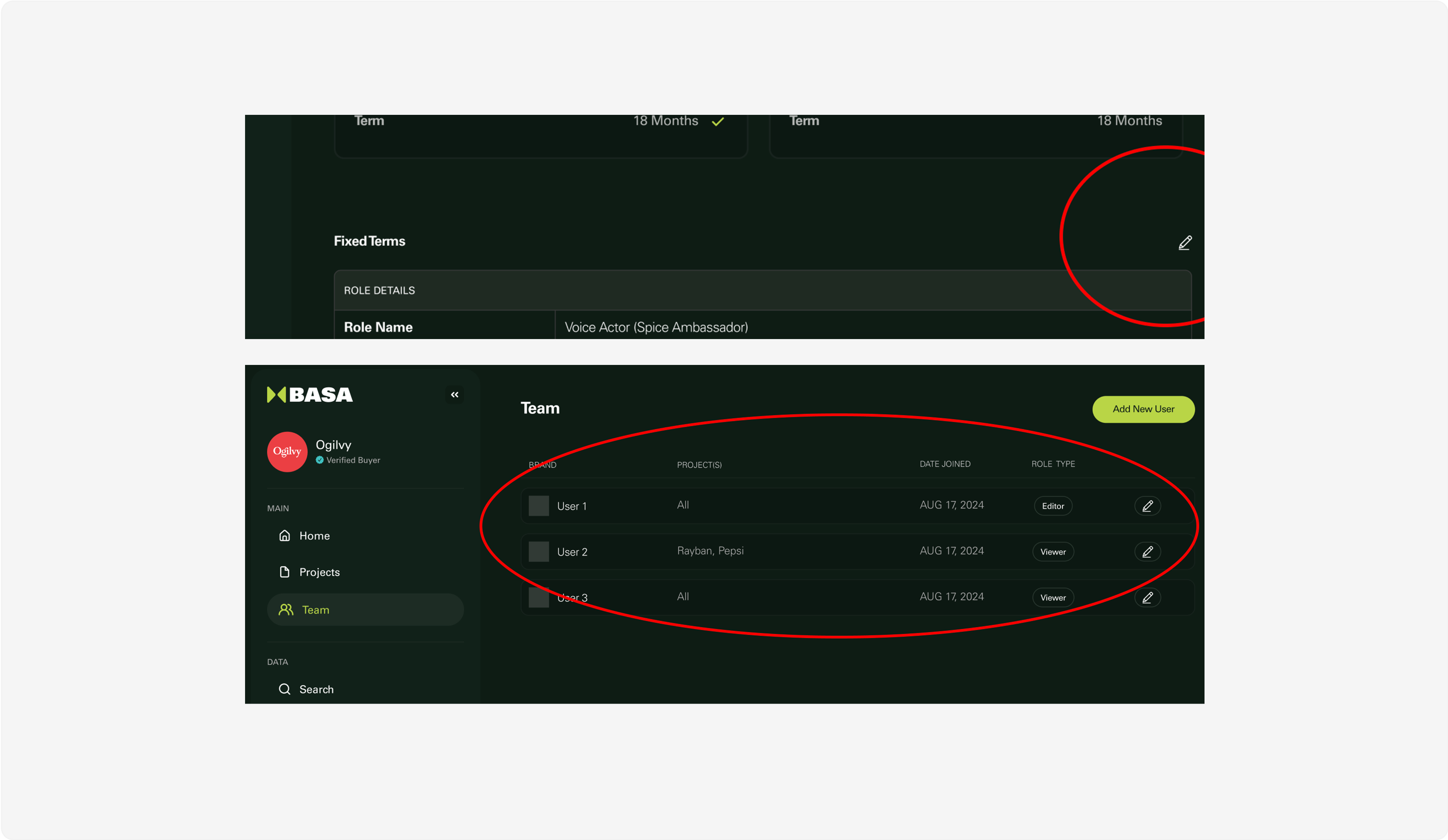
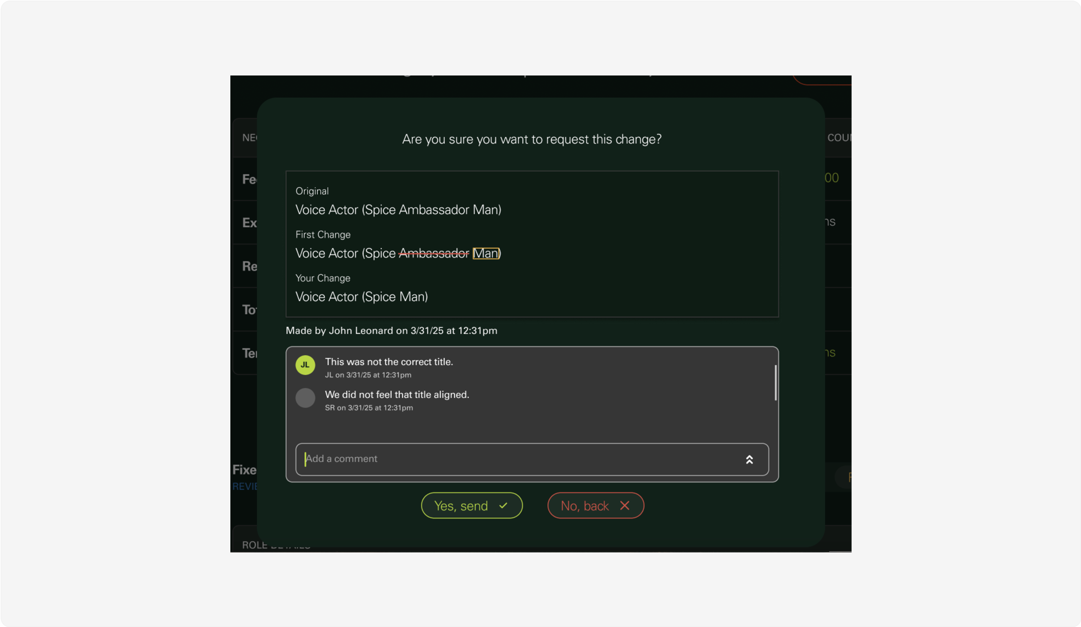
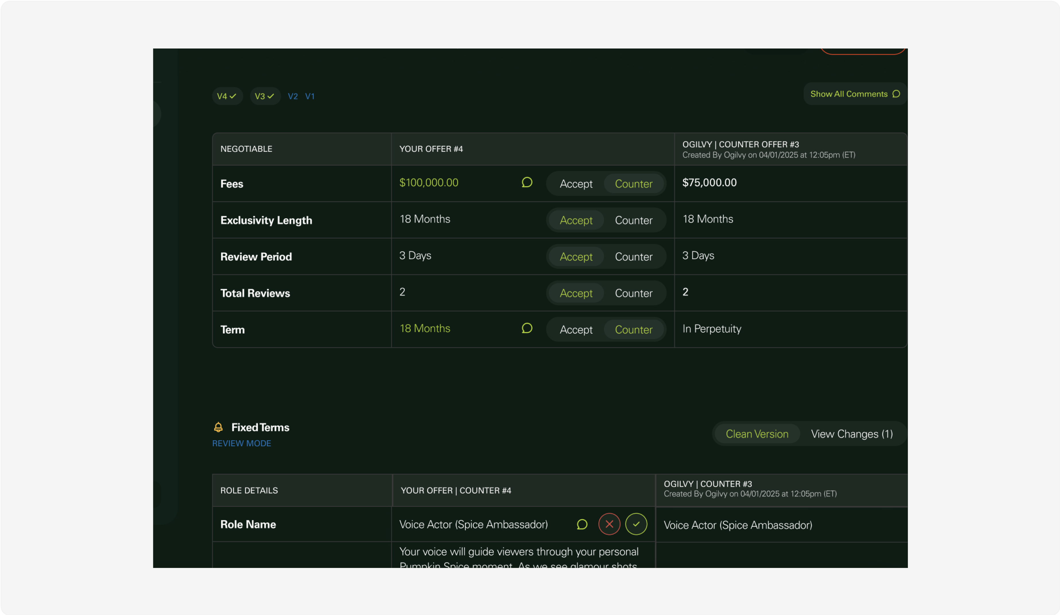
Tthe final solution not only included an editing screen or section to the designs, but it also included a review screen.
After about the 2 week time period solely focusing on red-lining, we moved on to other needs on the platform as well. These consisted of building out the Talent Side experience a bit more and the outreach communication from the Client Side.
The fixed terms editing/red-lining feature quickly became a selling point, and Clients became really interested in that piece on its own.
This project was fast-paced and really exciting. Lots of movement, allowed for lots of impact and influence as a designer. As a team we started discussing lots of new features and changes, it was a project I thoroughly enjoyed. I learned a lot, one thing I will take away from this project is to remember to look at the full picture before diving into the solution.
