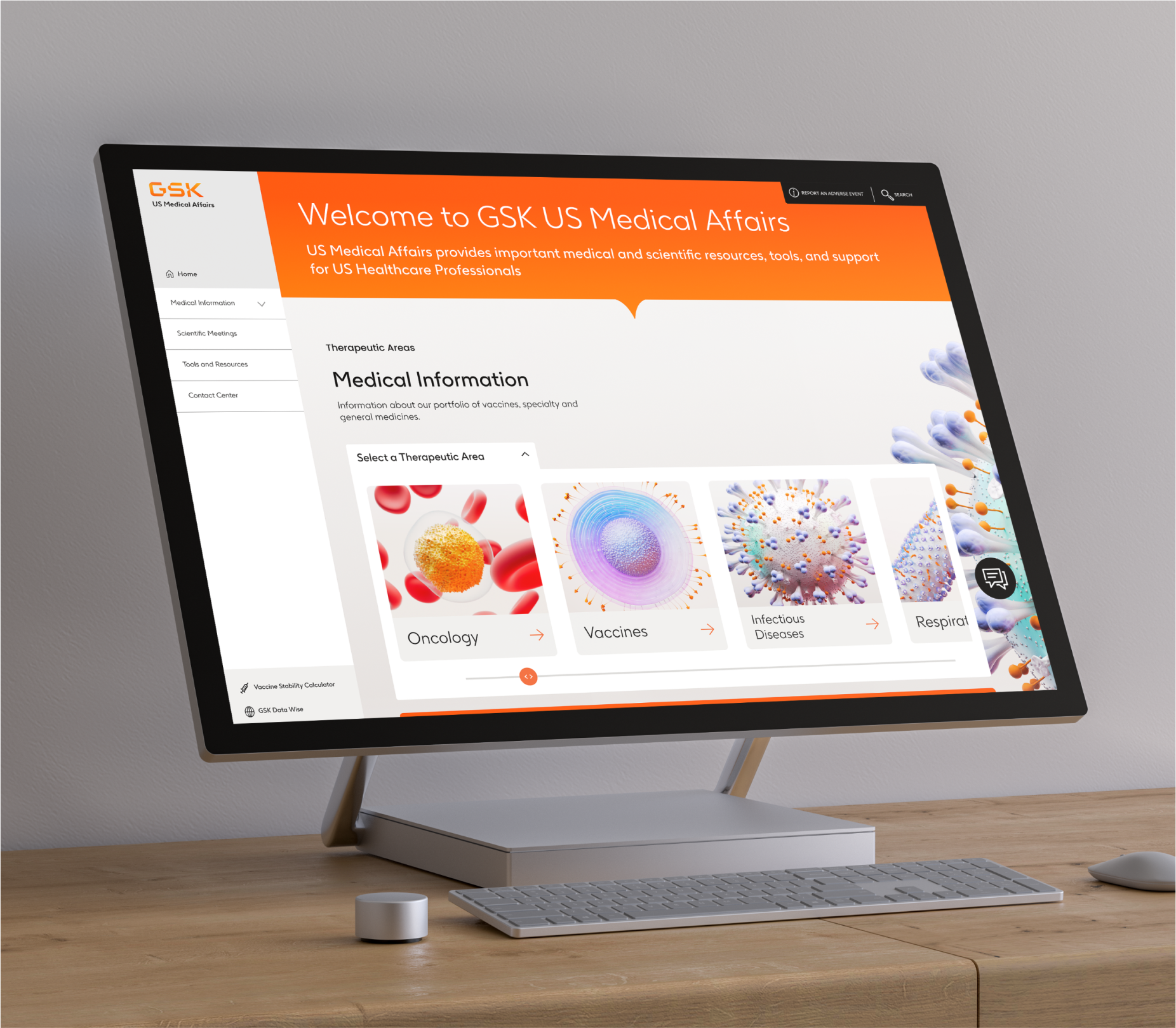
GSK Medical Affairs needed a full redesign and refresh. The site was extremely outdated, not working well and not a big audience using it. This was the biggest and longest project I have worked on, spanning about 2 years total from initial discovery to implementation. Our team touched on everything from interviews, user testing, to content discovery and implementation.
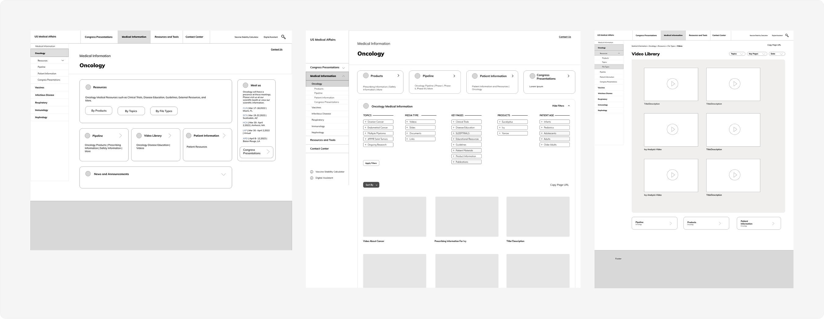
Before beginning the redesign, a major focus of the project was understanding the existing platform, its users, and the complexity of the broader medical affairs ecosystem. GSK had a number of microsites that we needed to accomodate for and integrate into the main experience. The architecture of the previous site was confusing and disorganized, making it difficult for users to navigate and quickly access research materials.
To better define the problem space, the work included stakeholder collaboration, user interviews, user personas, competitive research analysis, and rework of the information architecture.

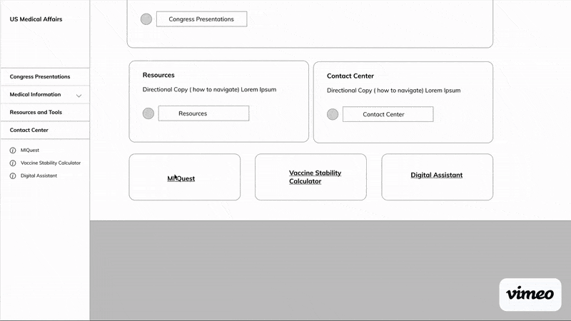
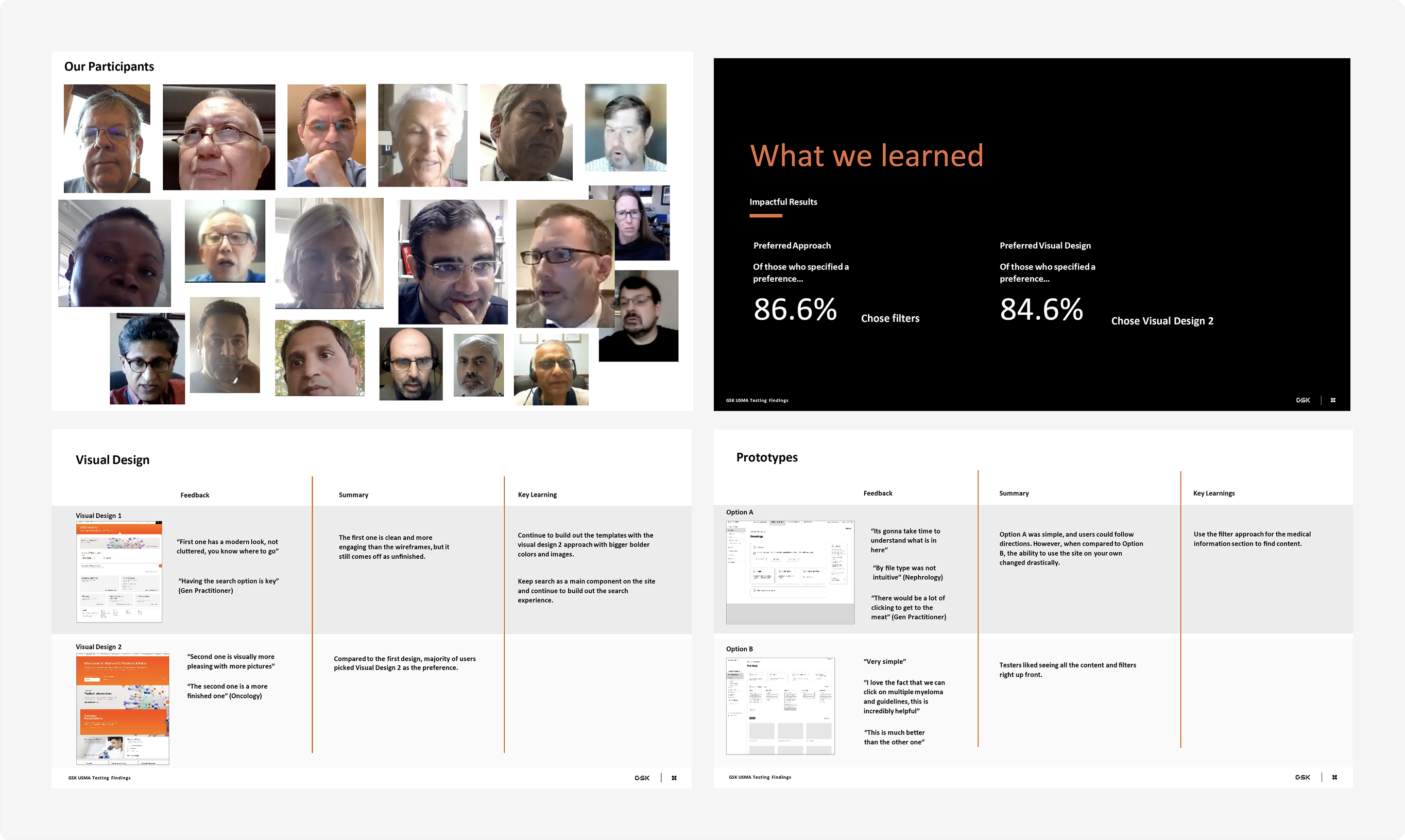
Following the initial architecture and research phase, the project moved into iterative wireframing, visual exploration, and usability testing to refine the overall experience. Multiple design directions were developed and reviewed collaboratively with stakeholders and users, helping validate key interactions, improve navigation patterns, and guide the platform toward a more intuitive and scalable final solution.

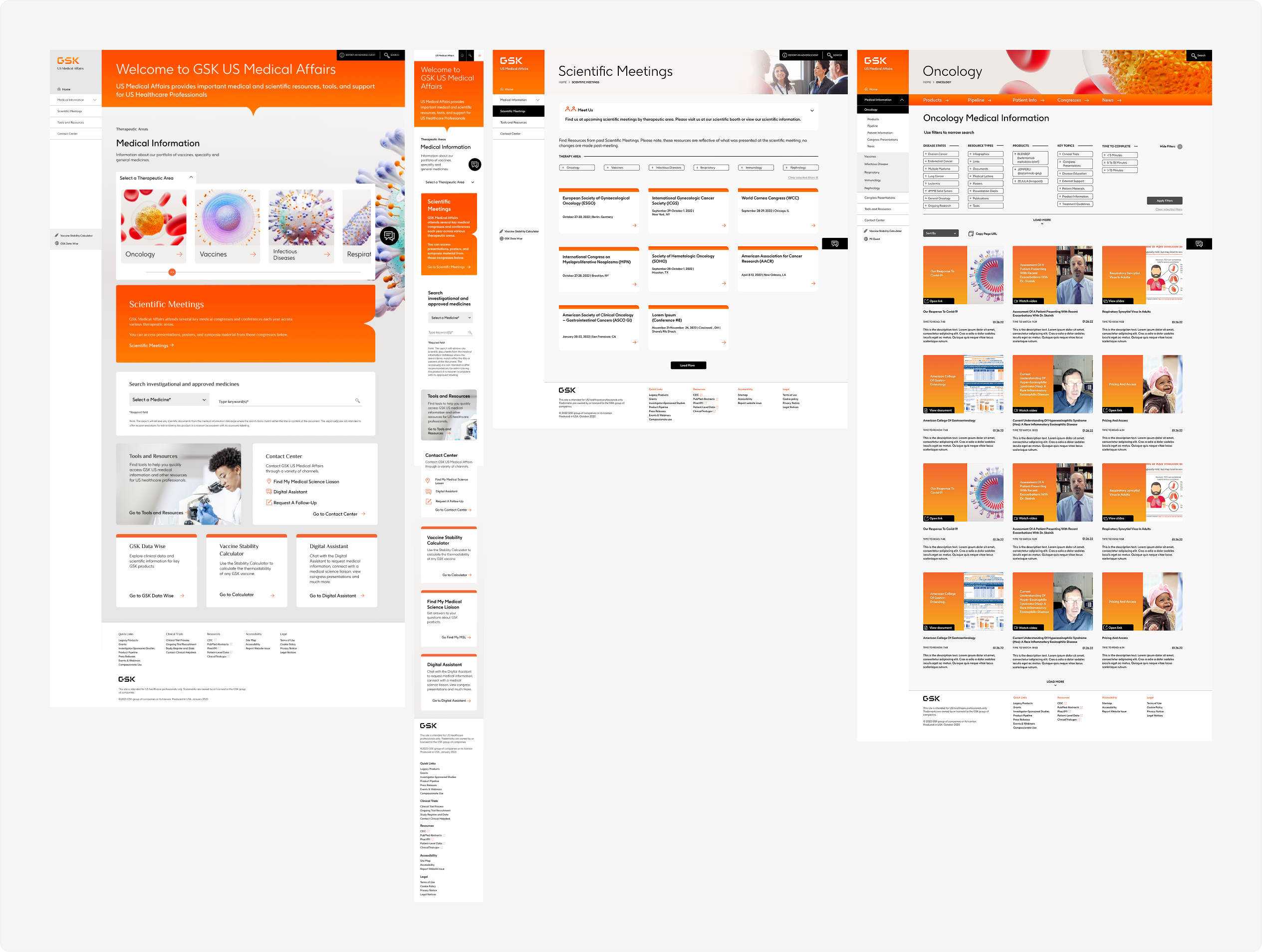
Following the design and testing phase, the project moved into long-term developer collaboration and implementation support to help ensure the experience translated accurately across the platform. This included ongoing design reviews, iterative refinements, and revisiting components as new technical considerations and usability needs surfaced throughout development.