Courage Music Partners, based in Nashville, needed a full redesign of their internal database platform, known as Yoda. As a record label services company, they relied on this system to track the buying, selling, and streaming of their catalog across multiple platforms, time zones, and countries. But the current setup was fragmented and outdated, leading to major inefficiencies in how teams worked with the data.
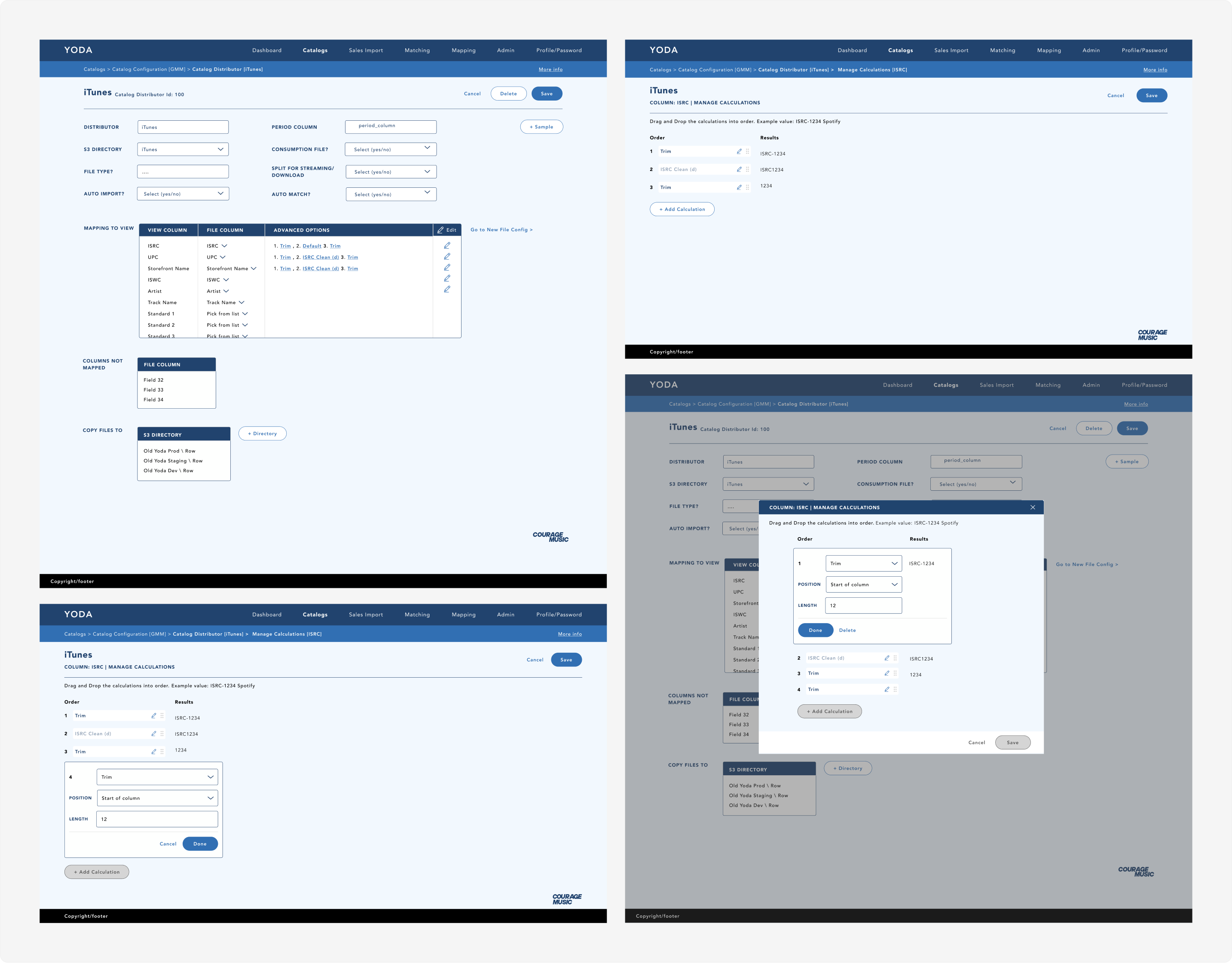
The project began with fragmented Excel-based workflows and loosely defined user paths that made the platform difficult to scale and navigate. A major focus of the early work involved restructuring the overall experience architecture by redefining user flows, organizing operational logic, and translating disconnected spreadsheet systems into a clearer product framework through information architecture exploration, workflow mapping, wireframing, and ongoing collaboration with stakeholders and internal teams.

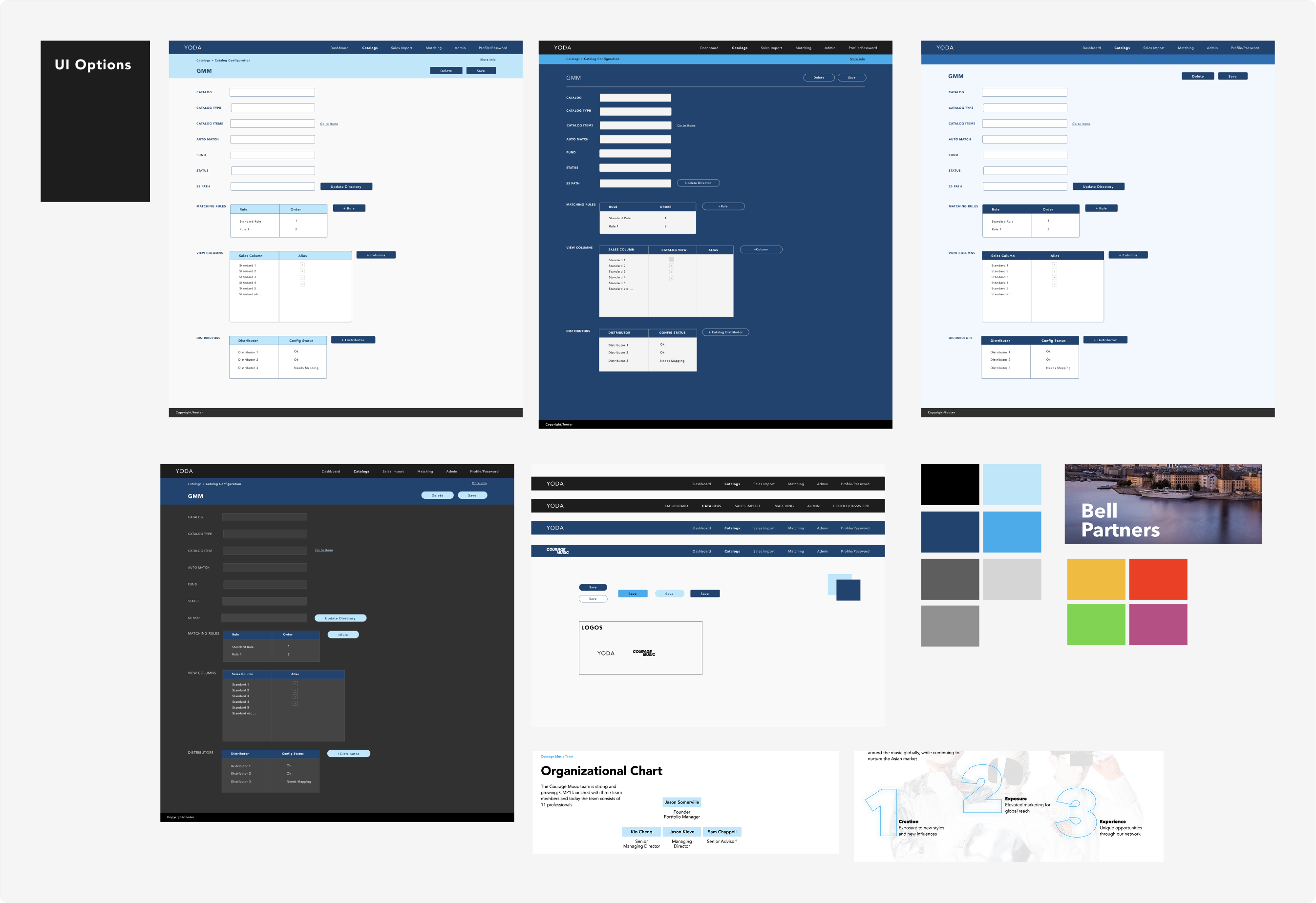
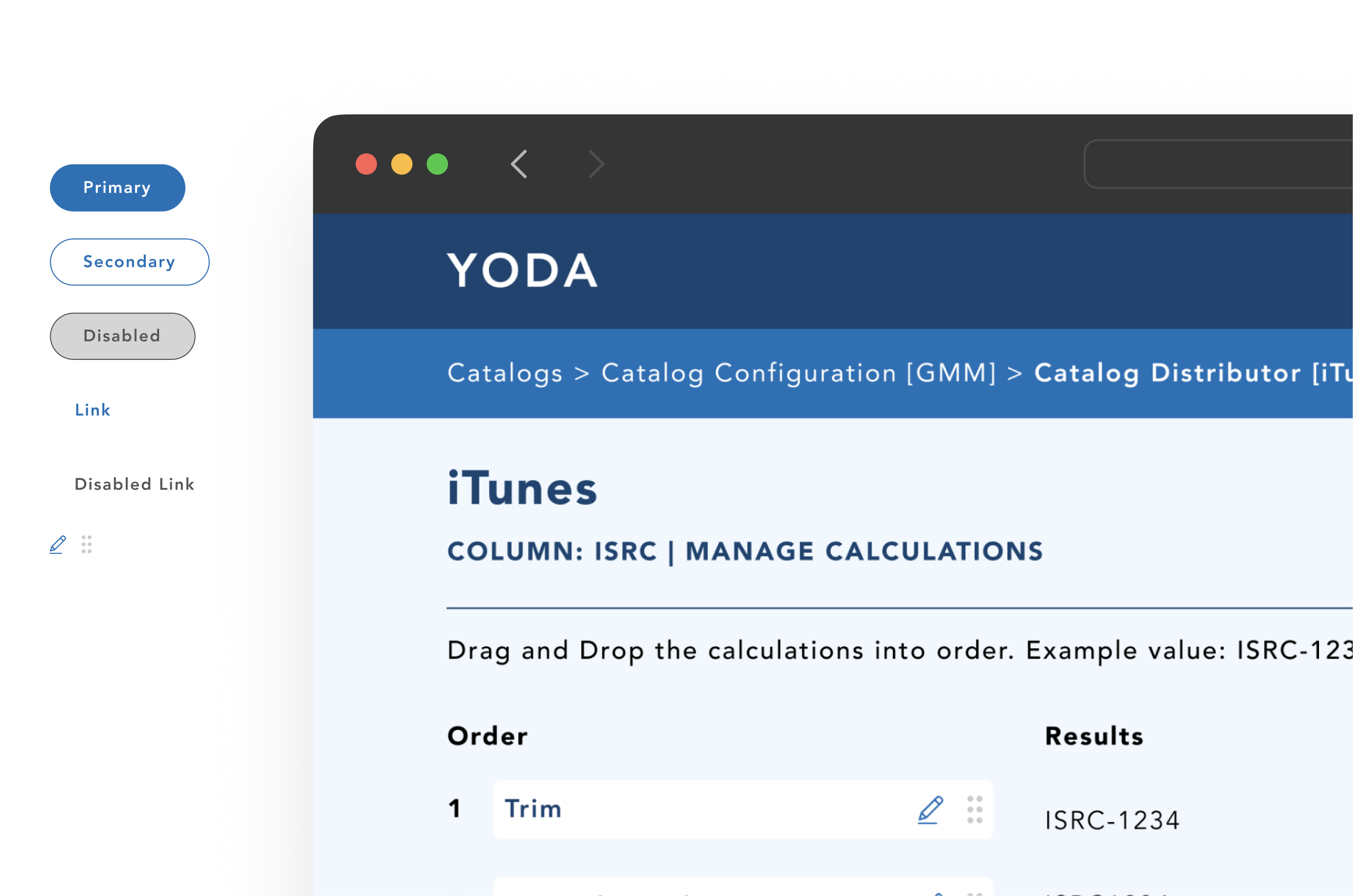
With the platform architecture and workflows more clearly defined, the project moved into establishing the visual direction and broader design system for the experience. This phase focused on creating a more cohesive and scalable interface through iterative UI exploration, component thinking, interaction patterns, and responsive layouts that could support the platform’s growing operational needs while improving overall usability and consistency across the product.