
Web Design, User Research, Visual Design
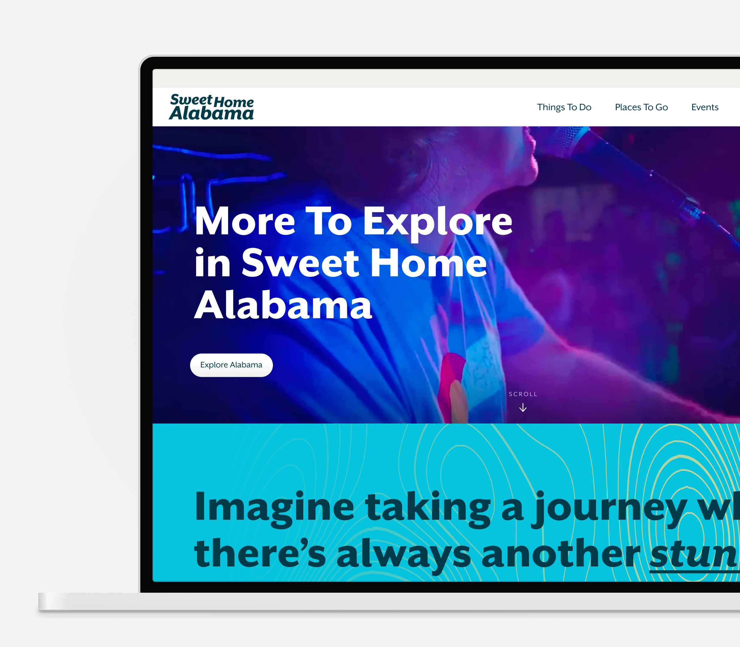
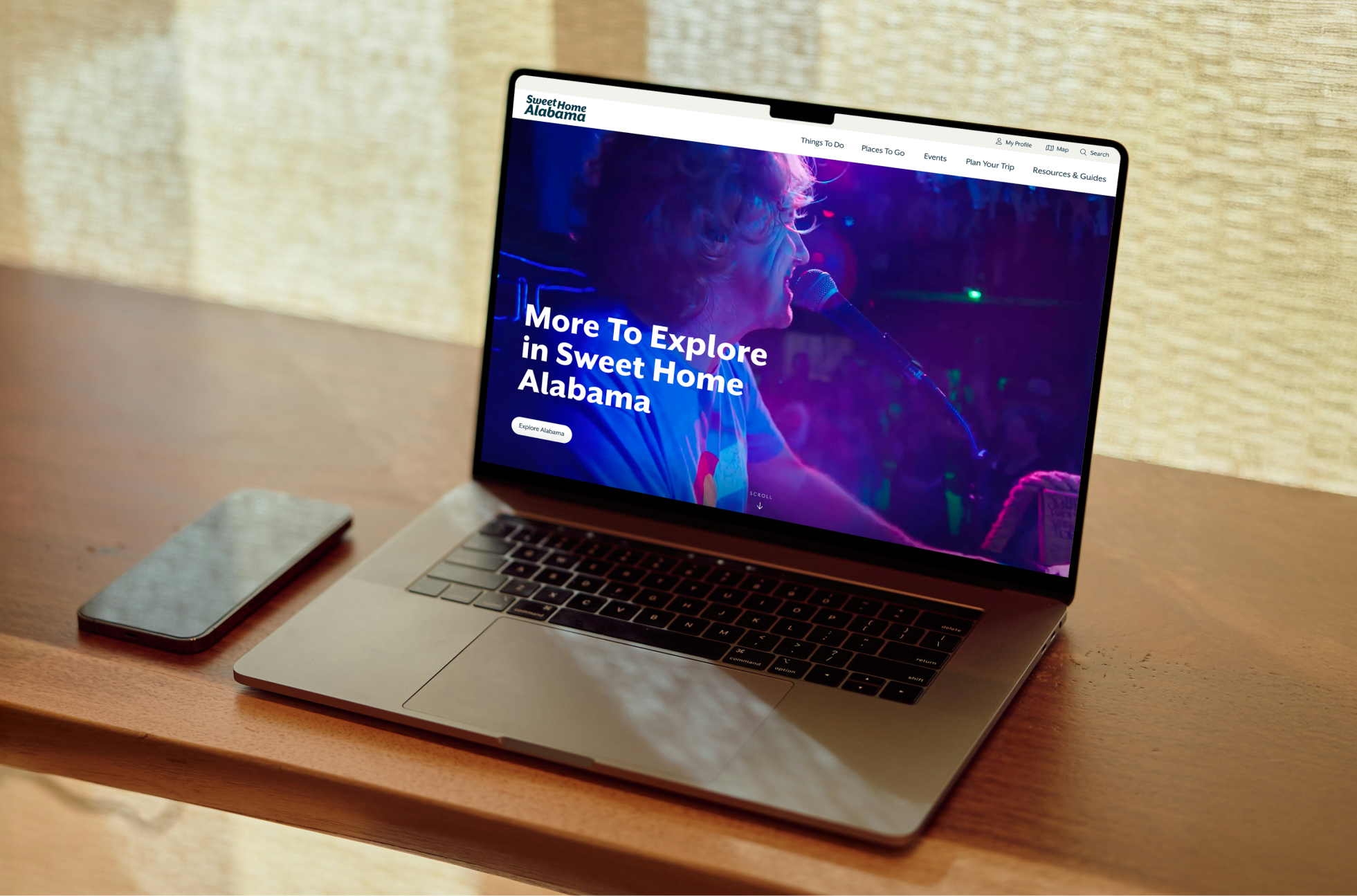
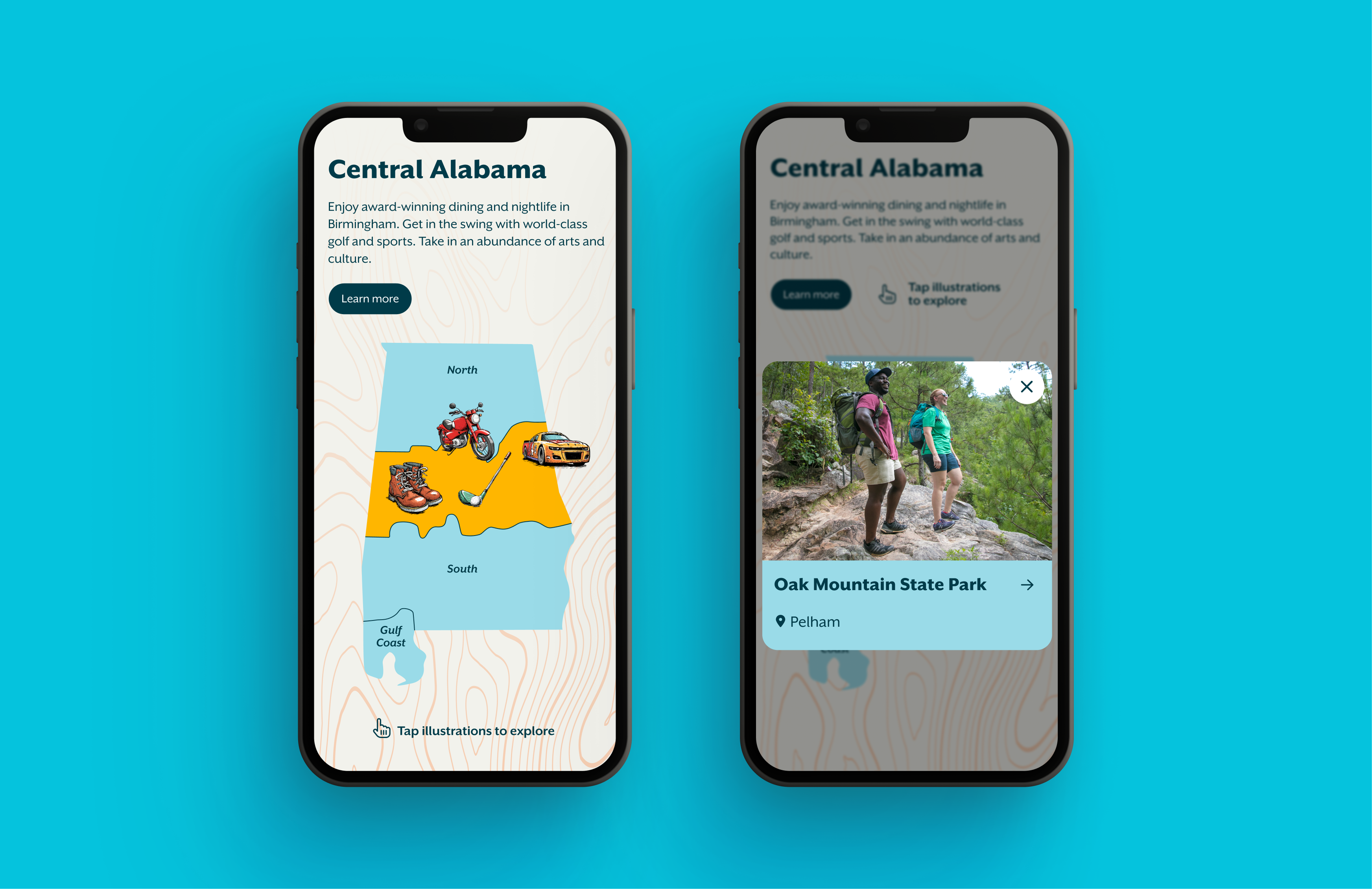
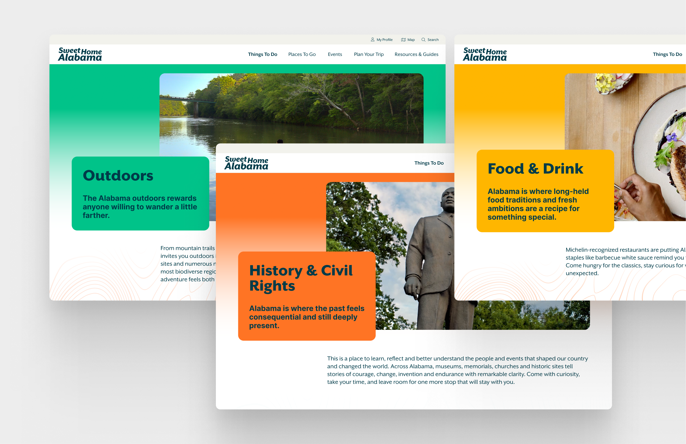
The Alabama Tourism Department has been a client of my client for many years. It had been over 10 years since their website had been updated, and with the new modern era and keeping up with Alabama as a top destination this was an invaluable investment.
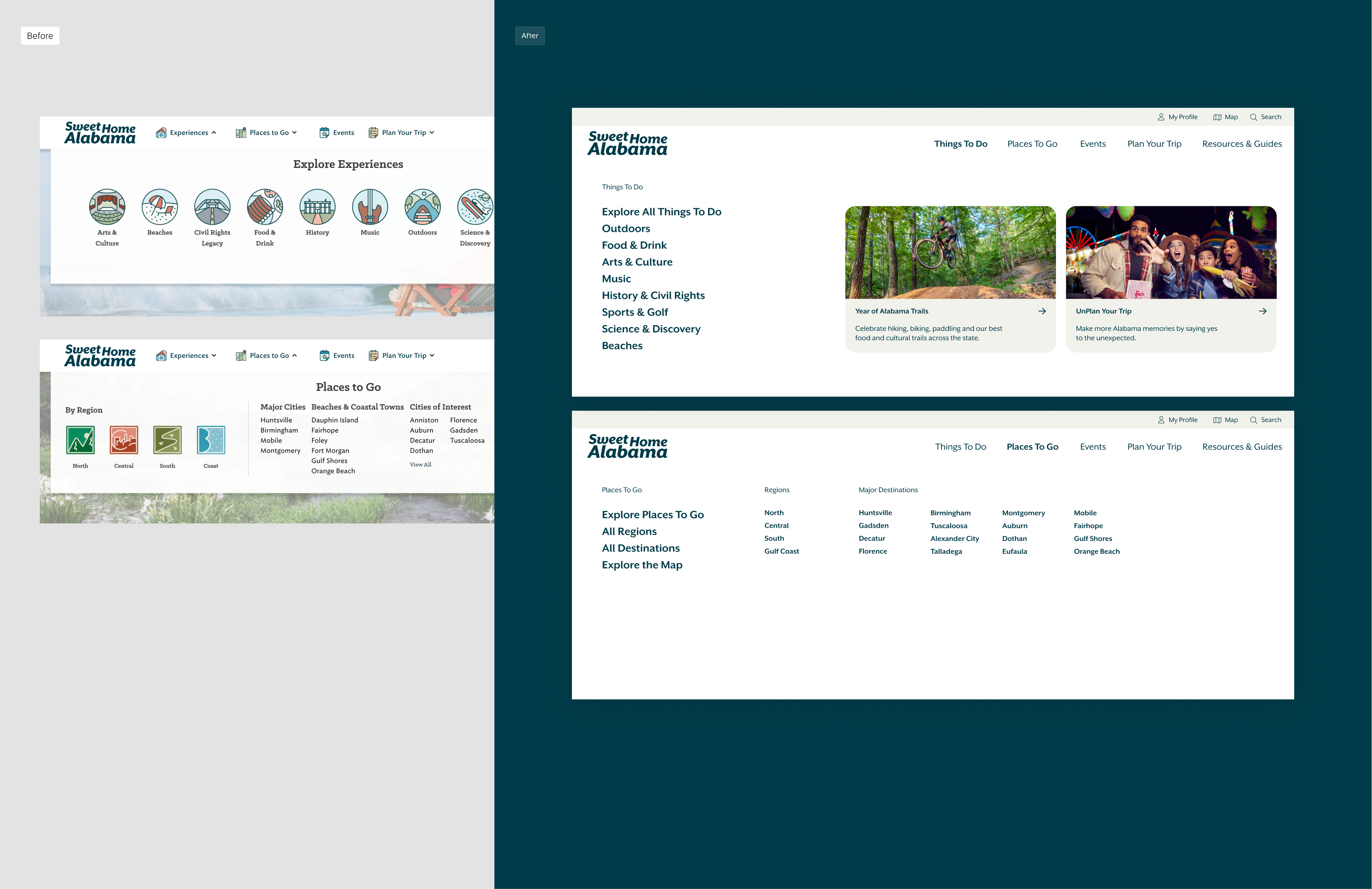
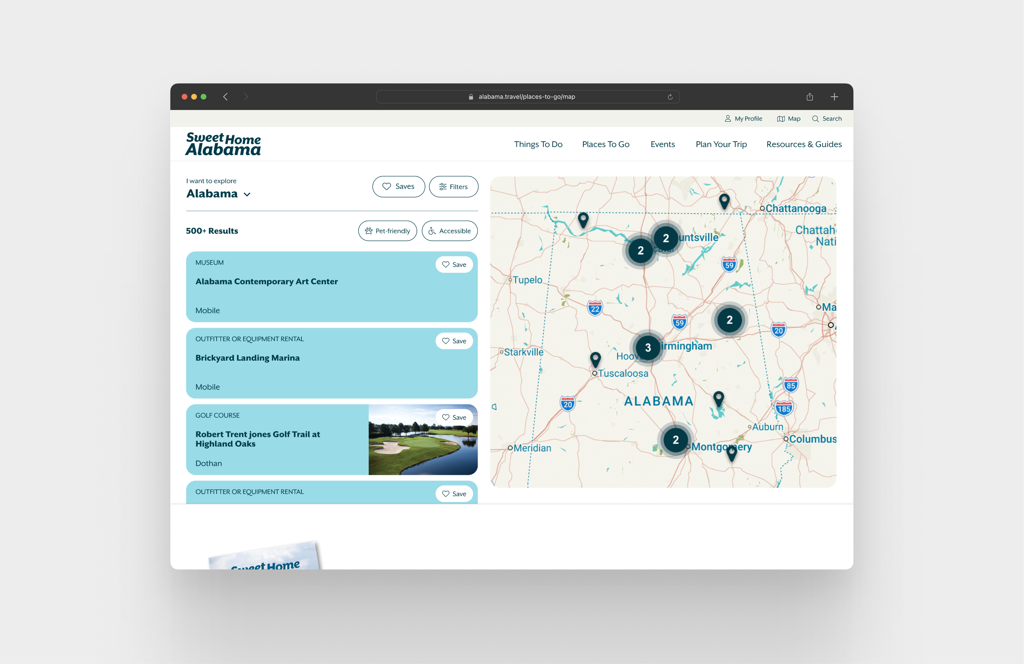
The site was extremly outdated and in ways non functional. There is a partner portal to the platform where partners and businesses across the state can update and add their location to the website to be searched for and found by travelers. Our job was to not only update the architecture, discovery and visual feel of the site, but to consider the partners as well in the resdesign and how their information on the backend can be better served for users.
As a lead designer on the project, I lead user research, through architecture and wireframes, and worked with another designer to implement visual look and feel. This projects spanned nearly a year with continued updates to come.

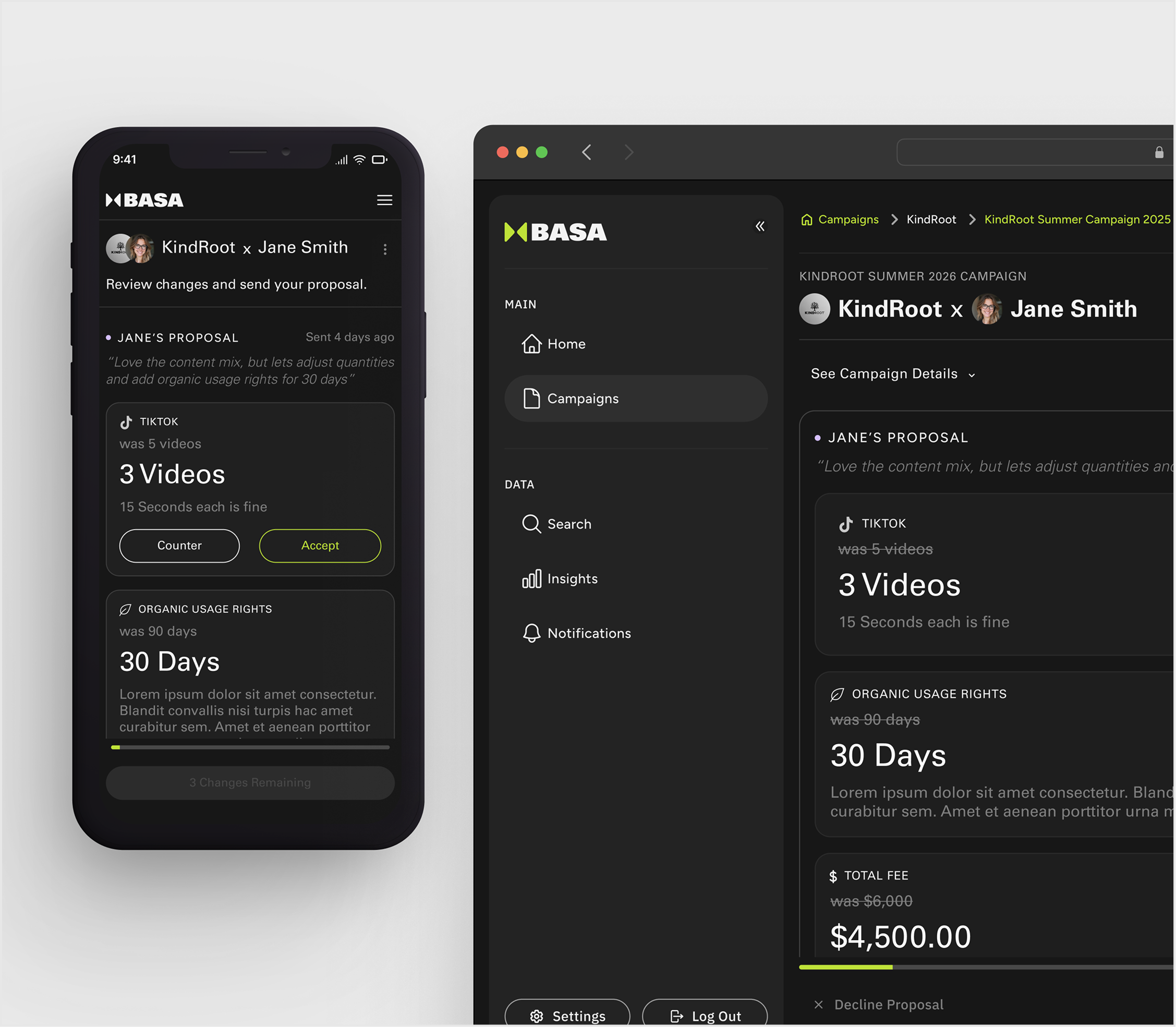
Product Owner, Product Design, Web & Branding Design
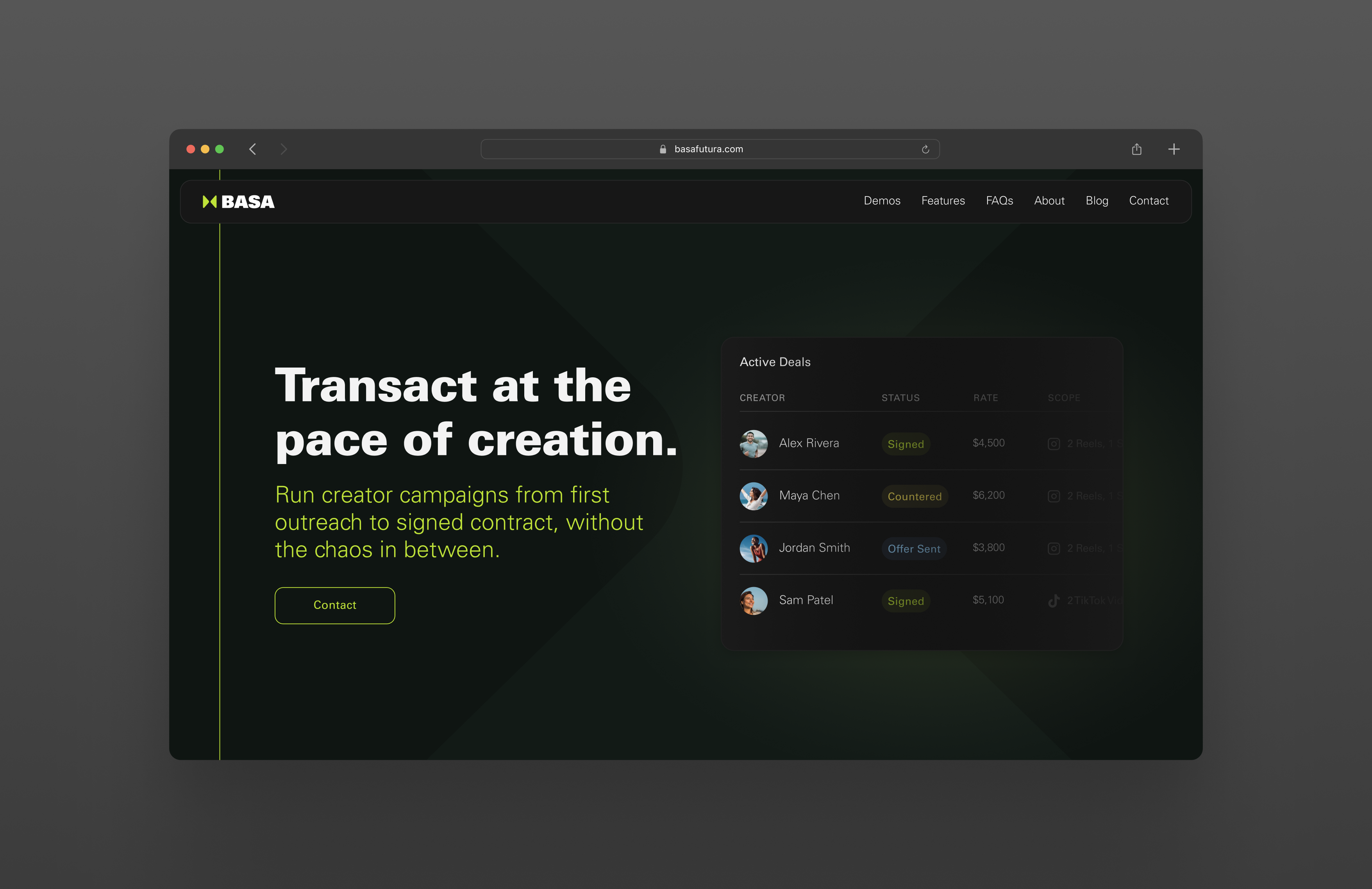
Returned to Basa for a longer and larger contract. This work consisted of continued product design & systems design work, with added product ownership, management, and web/brand improvements.
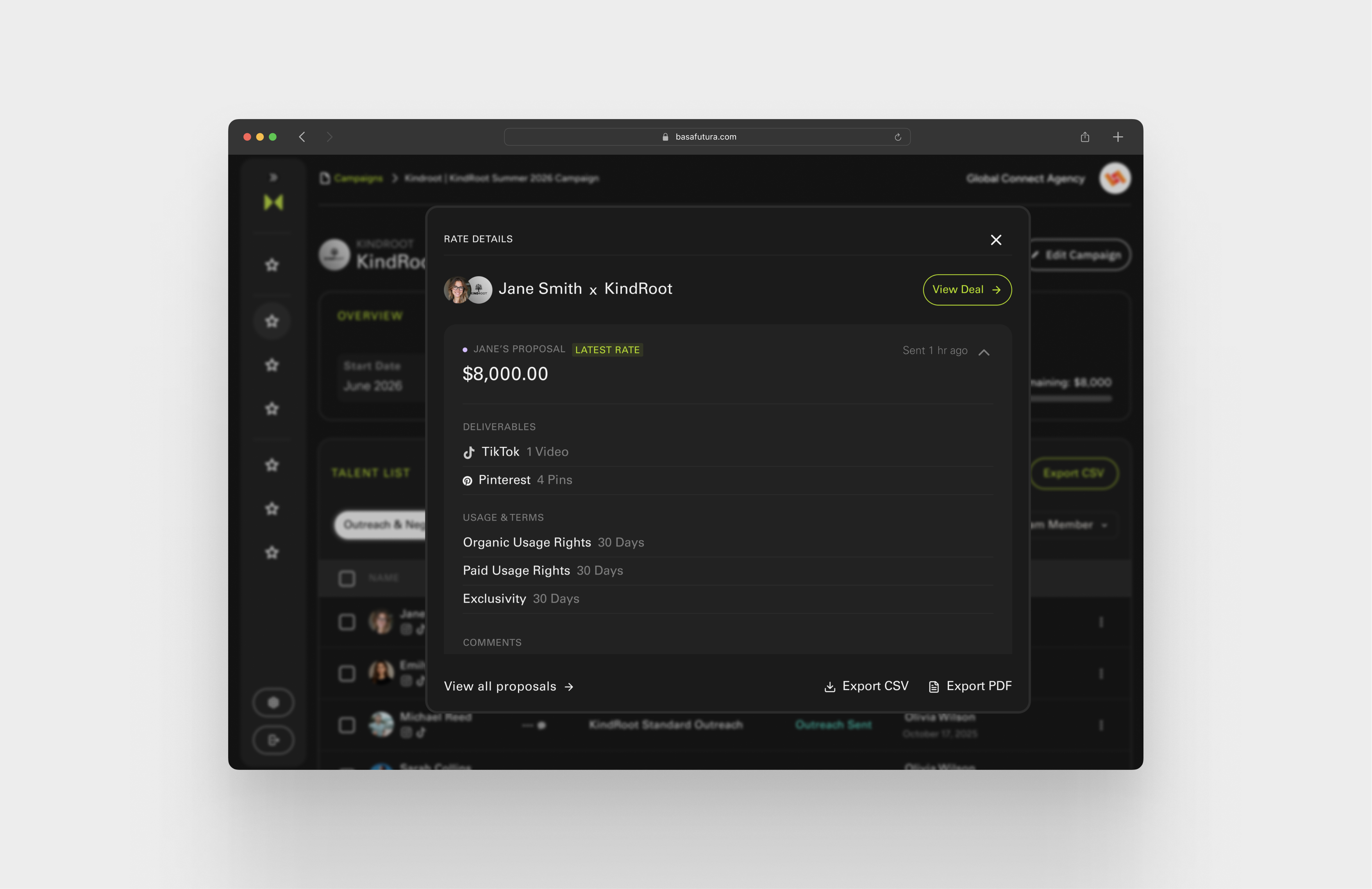
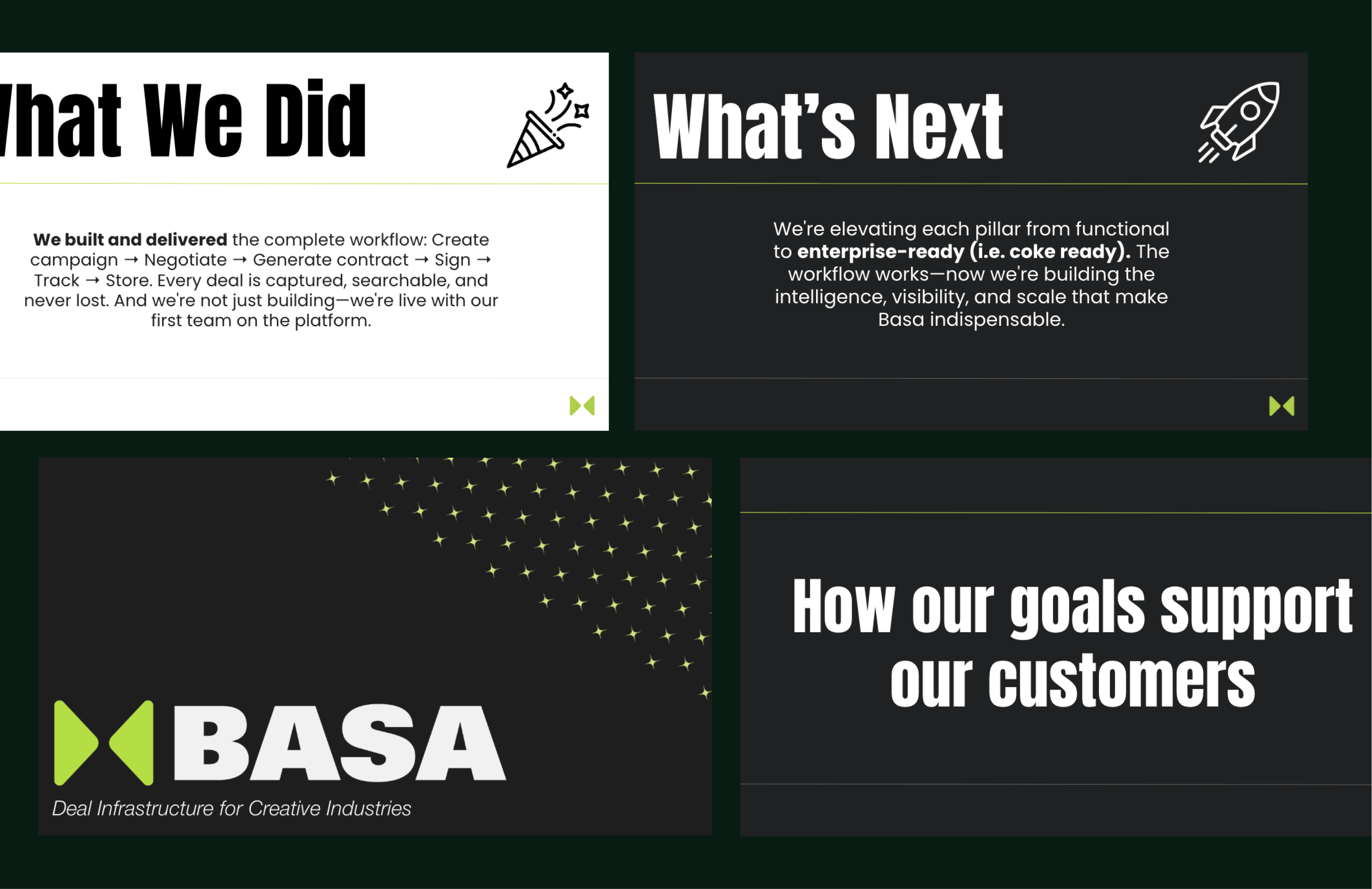
My position quickly moved to Product Owner and PM, including support in Biz-dev, competitive research, AI discovery and more. Excited to have more of an impact, I moved the team to continue pushing towards a enterprise ready platform. Jumping into demos, leading internal meetings and more. Building internal and client facing decks to support the growth of the company and the strategic directives behind it.
Product Design
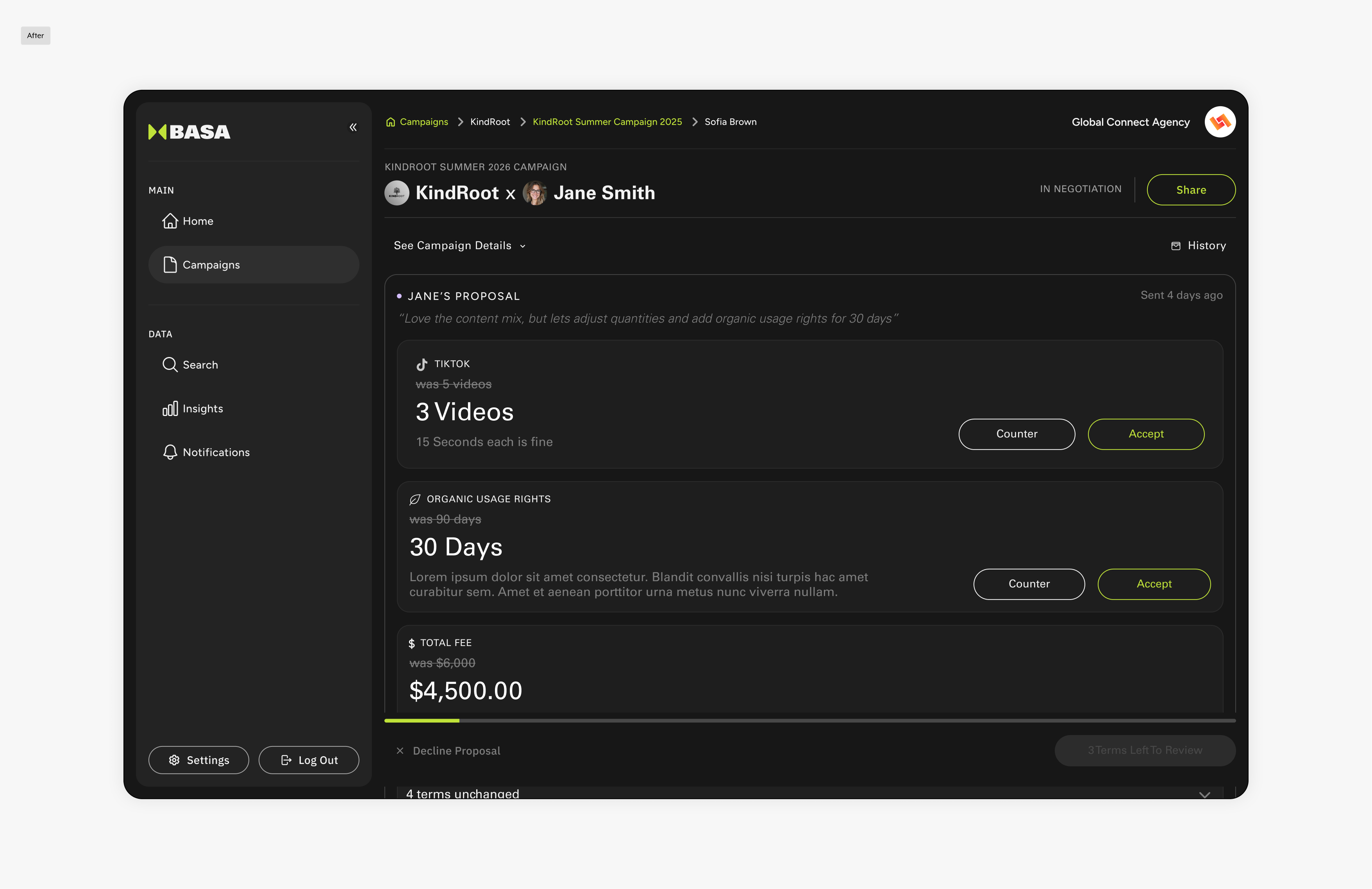
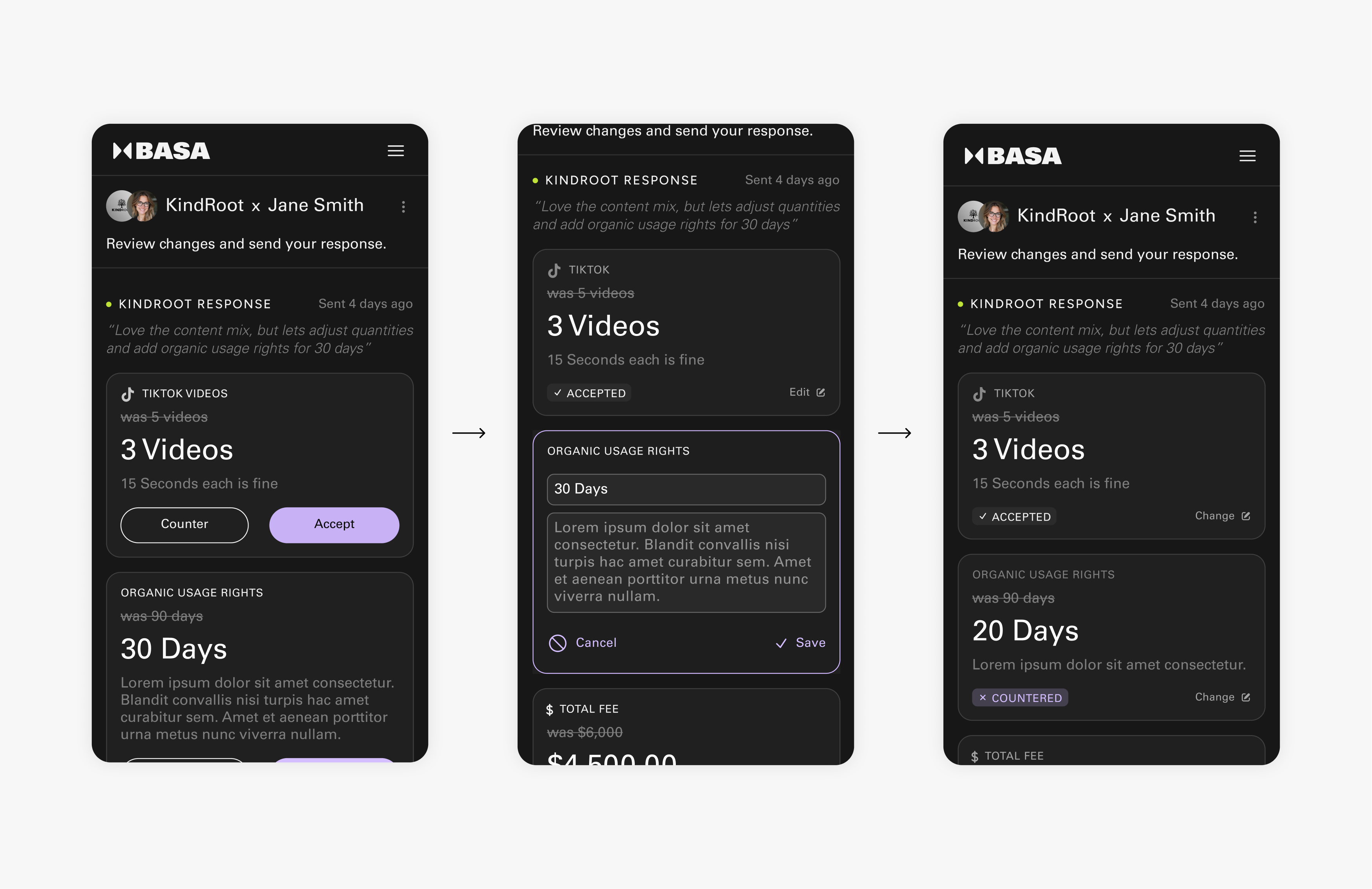
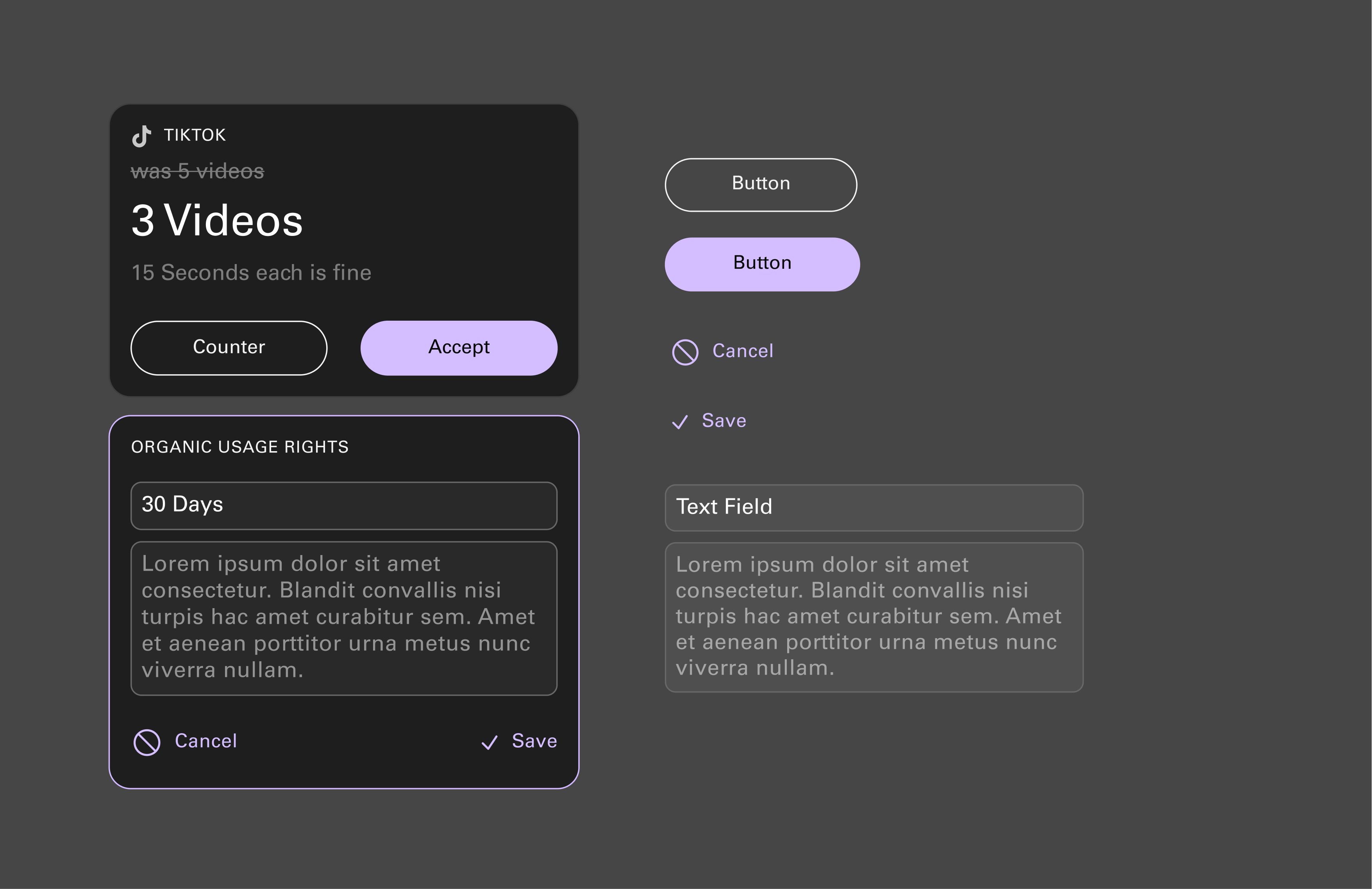
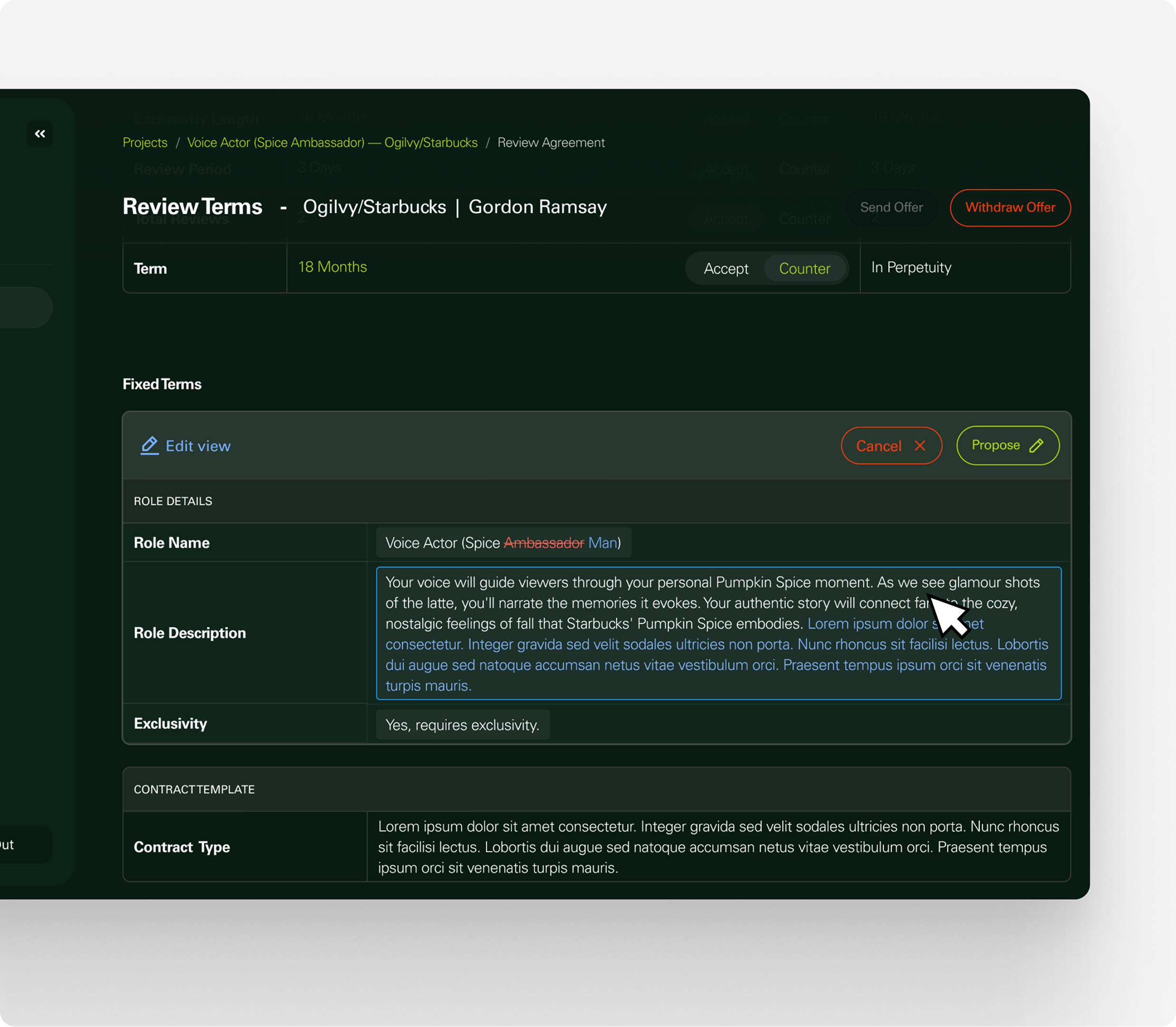
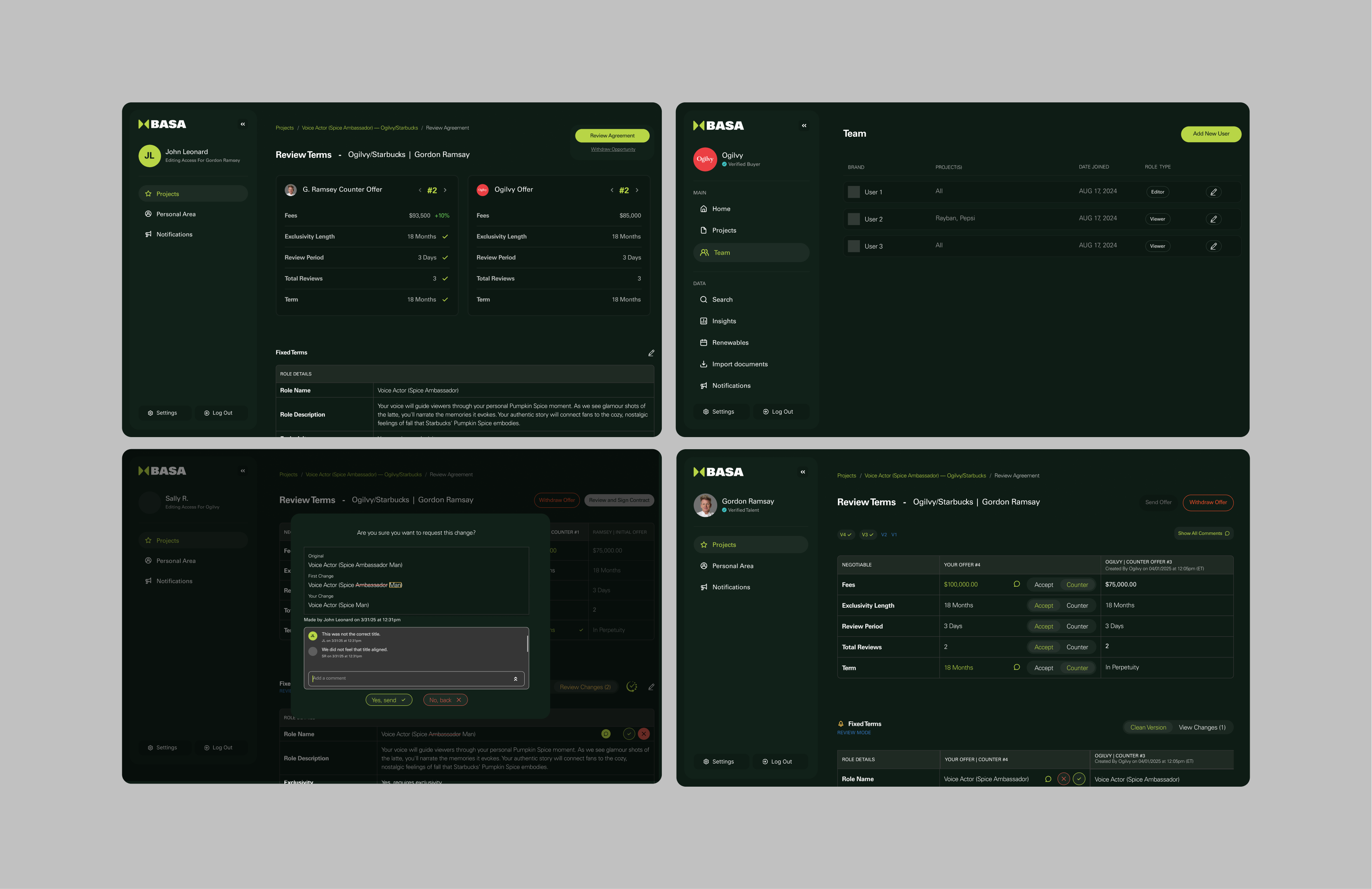
Basa is an Influencer Marketing Management software focused on deal-making and management. At the time, they needed direction on creating a flow to edit the fixed terms within a deal, these being the typical contract terms legal and business teams often redline. The work here focused on building a redlining feature within the software.
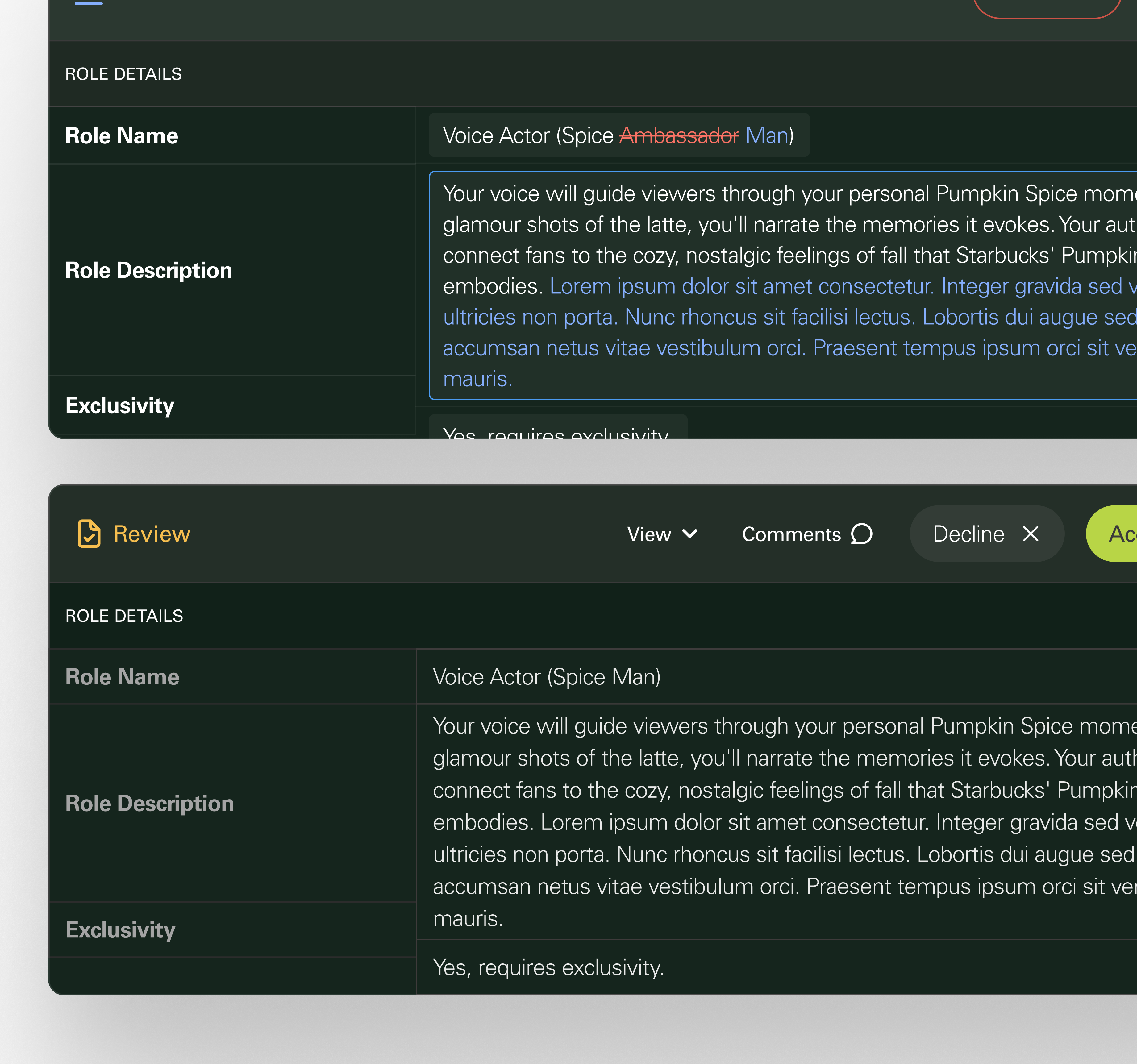
Early discovery focused on understanding the user needs and discussing with stakeholders how Fixed Fee editing should function across the platform experience. Initial exploration referenced familiar editing patterns like Microsoft Word track changes and collaborative review workflows to help create a more intuitive way for users to edit, review, and manage terms directly within the platform.
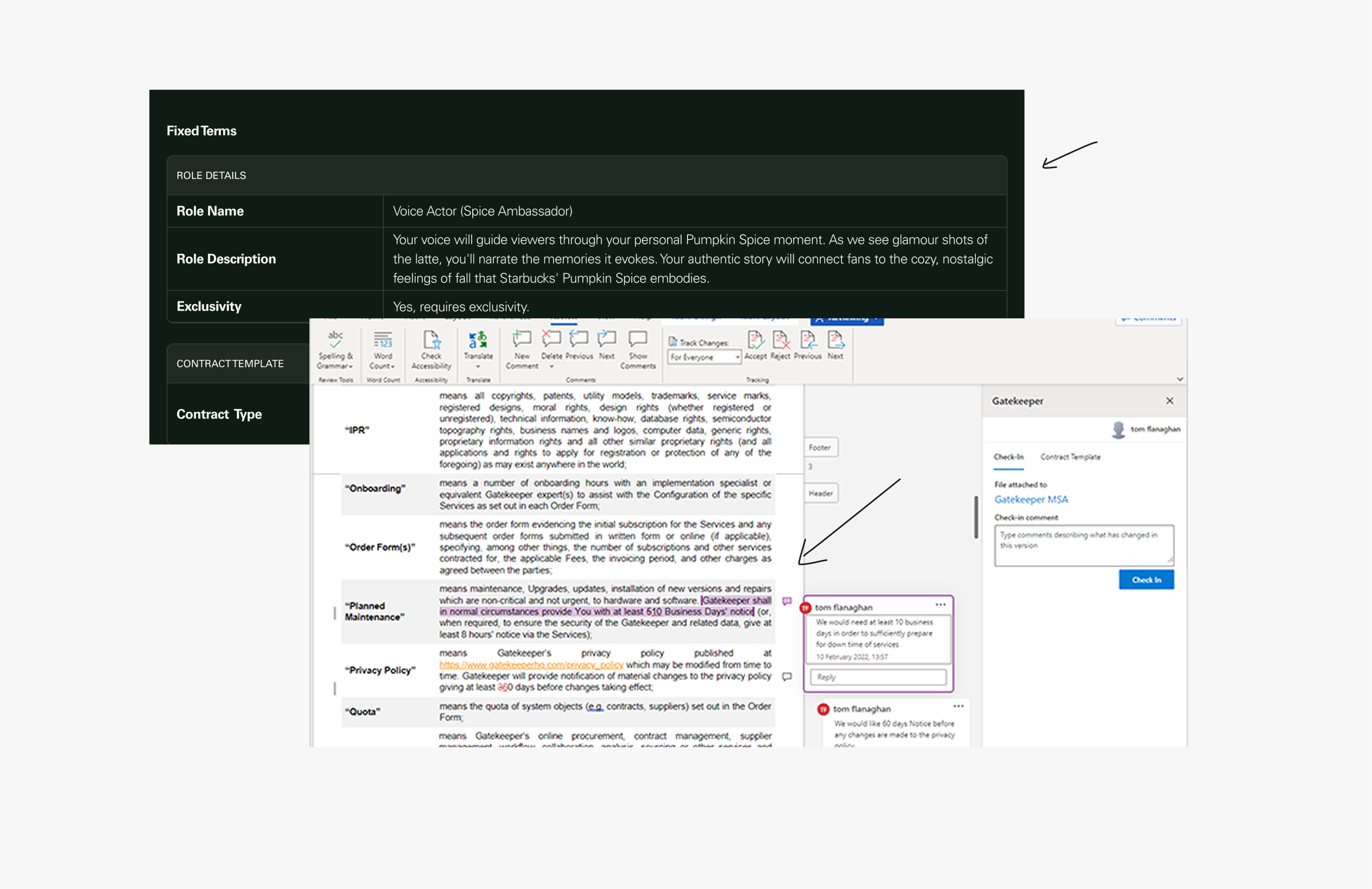
User flow exploration focused on adapting the existing platform structure and page layouts to support the this new workflow, helping define how editing, approvals, and review states could function within the constraints of the broader product experience.
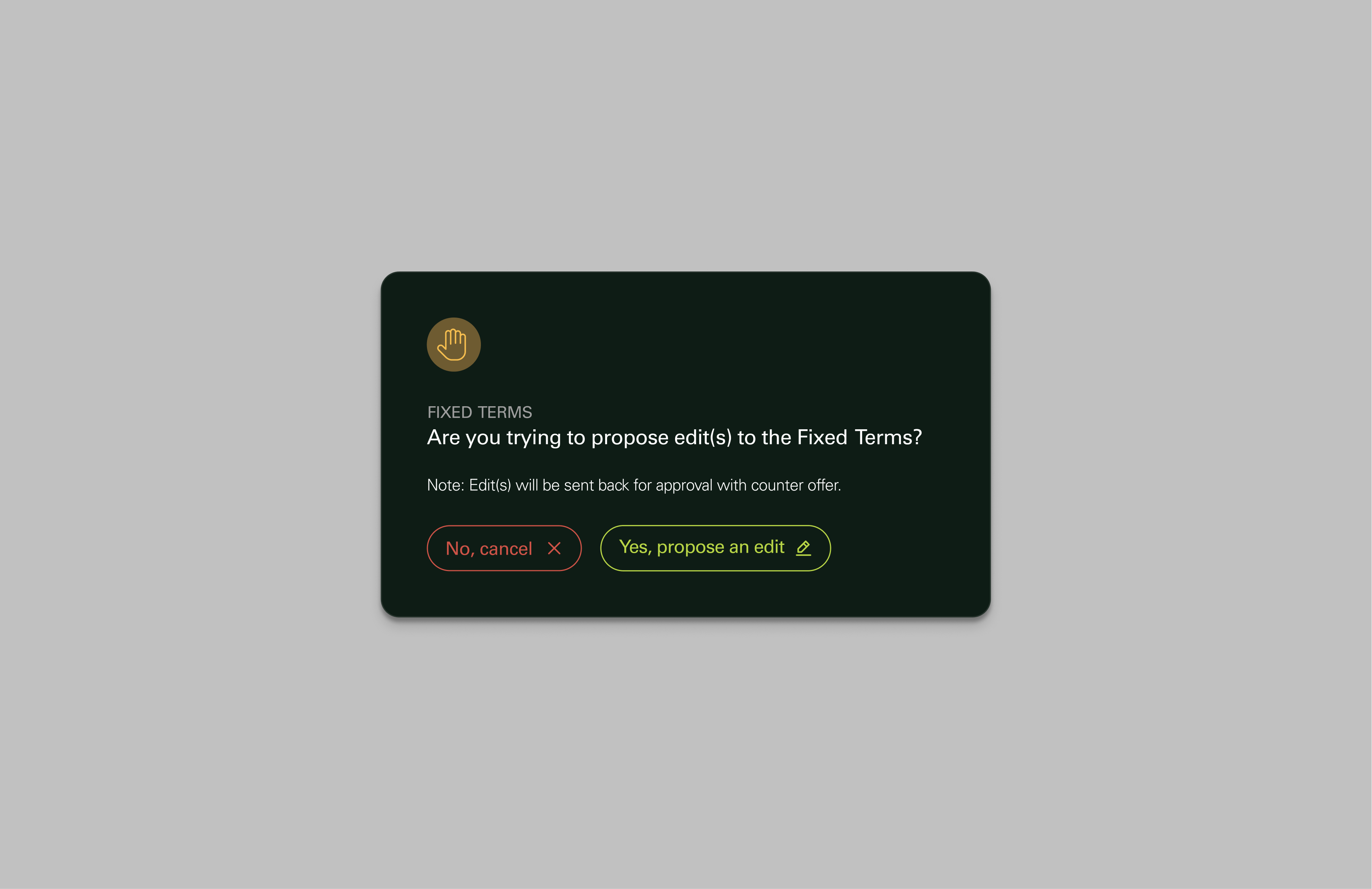
These designs evolved through multiple rounds of iteration focused on refining editing behaviors, collaboration states, approvals, and review interactions across the platform. Ongoing feedback from stakeholders and founders helped shape a more flexible workflow experience that balanced operational needs with clearer, more intuitive user interactions.
User Journeys, Visual Design

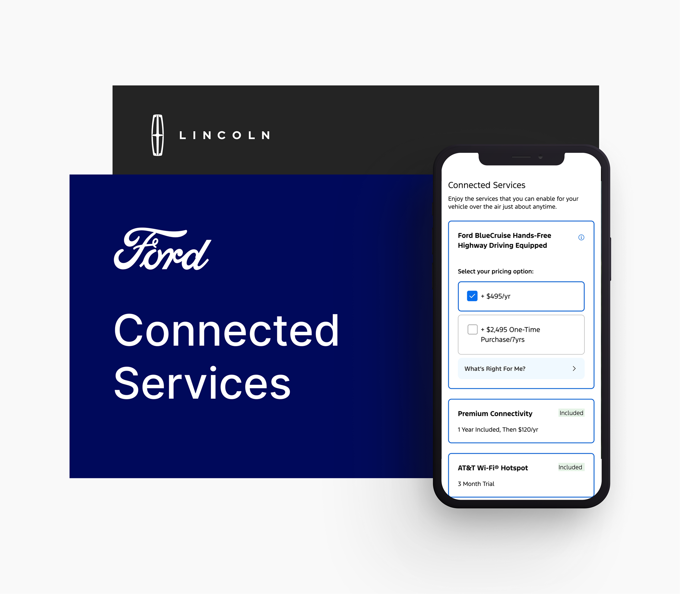
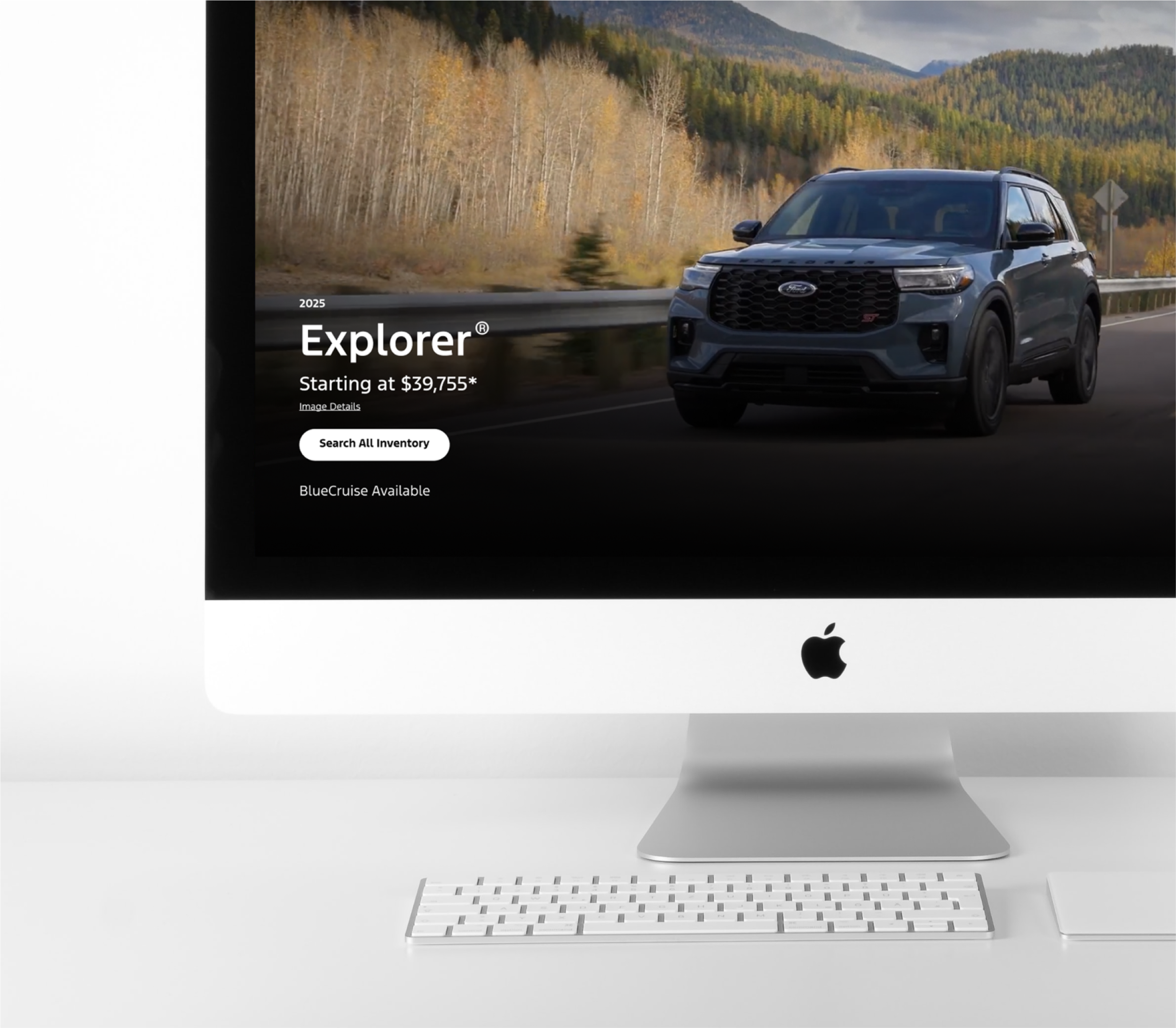
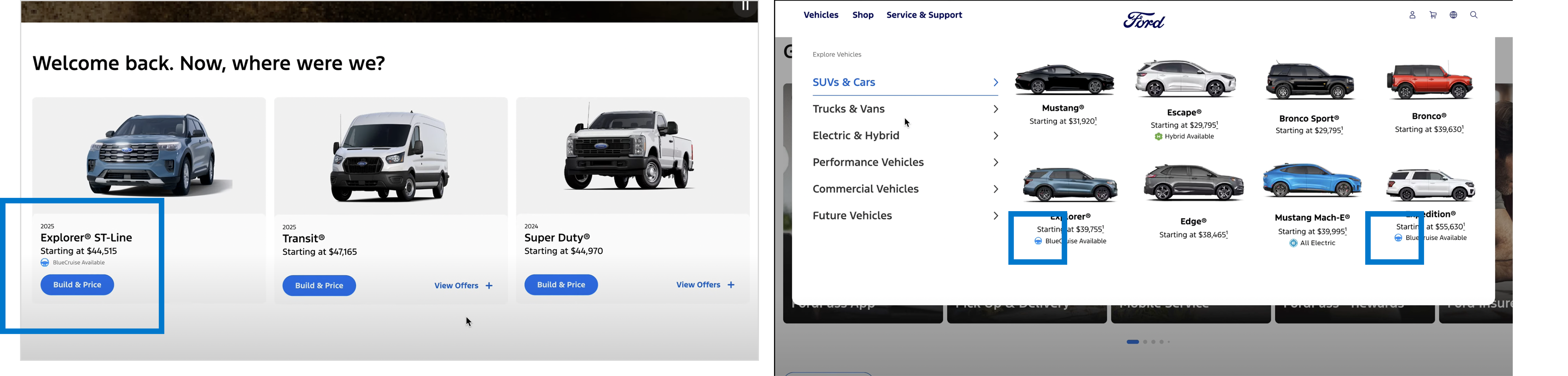
Through VML, I worked on integrated service experiences across the Ford ecosystem, helping shape connected user journeys tied to features like BlueCruise and vehicle ownership. Collaborating closely with product, strategy, and engineering teams, I designed scalable workflows that balanced evolving business goals with real customer needs.
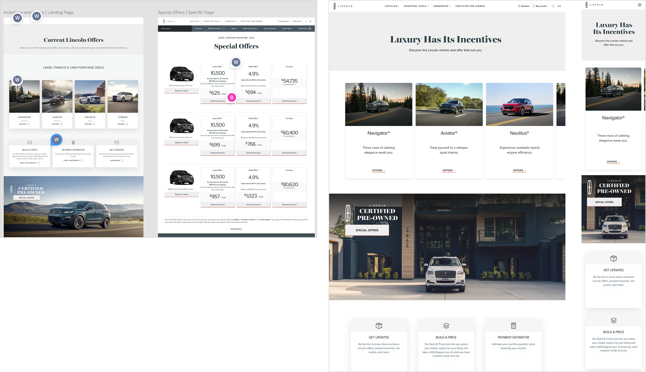
Under the same engagement, I contributed to redesigning Lincoln’s offers and incentives experience to create a more streamlined and responsive customer journey. The work focused on improving content organization, simplifying offer discovery, and designing scalable layouts that balanced business priorities with usability across devices.
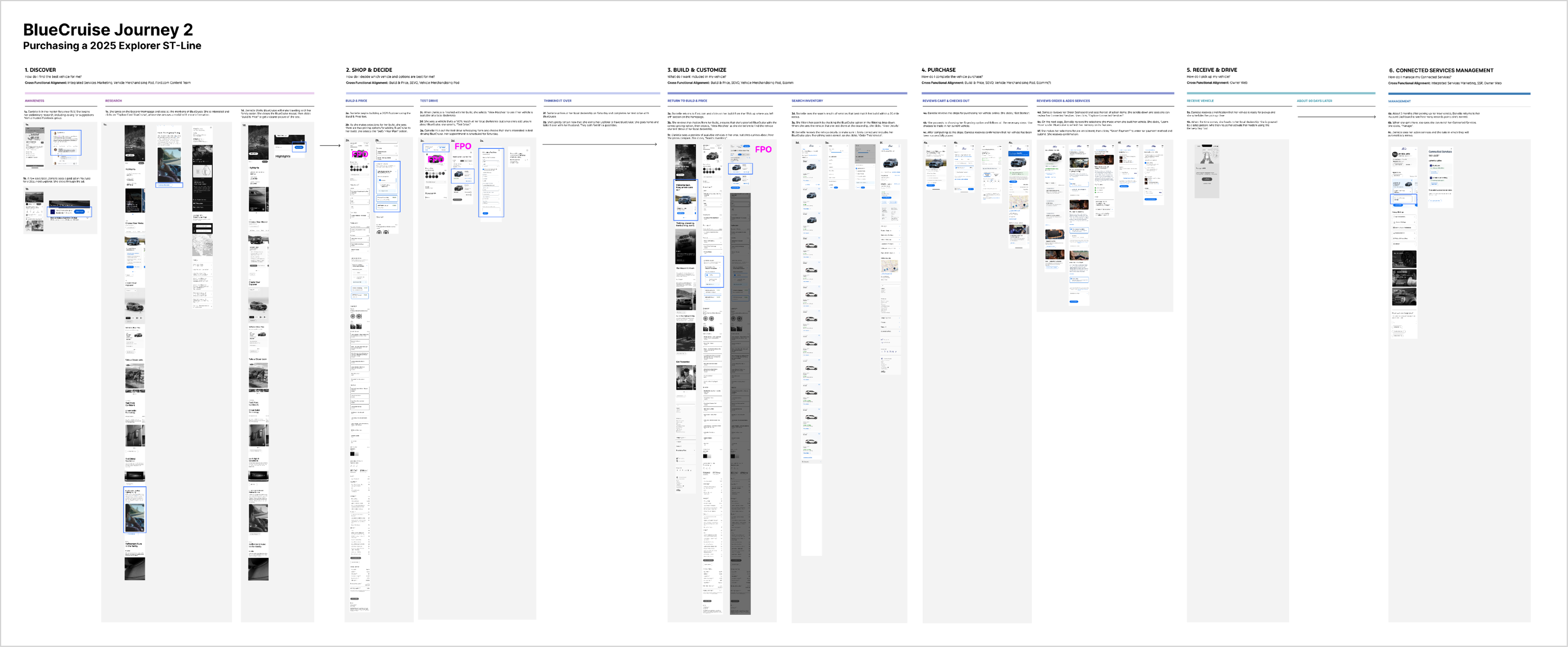
I helped define connected service journeys for Ford’s evolving Build & Price ecosystem, designing workflows that integrated vehicle services more seamlessly into the customer experience. The work served as a strategic exploration used to guide future product direction and stakeholder alignment.
%201.png)
As part of the connected services initiative, our team explored a badging strategy to improve visibility across key Ford browsing experiences. We partnered with Ford’s user research team to create prototypes and testing materials that helped evaluate usability and customer recognition.
I contributed to redesigning Lincoln’s offers and incentives experience with a focus on responsive layouts, interaction design, and improving offer discovery across devices. Working closely with copywriters, clients, and development partners, the project evolved through multiple rounds of collaboration and refinement to create a more streamlined customer experience.
End to End Web Design, Light Code Implementation

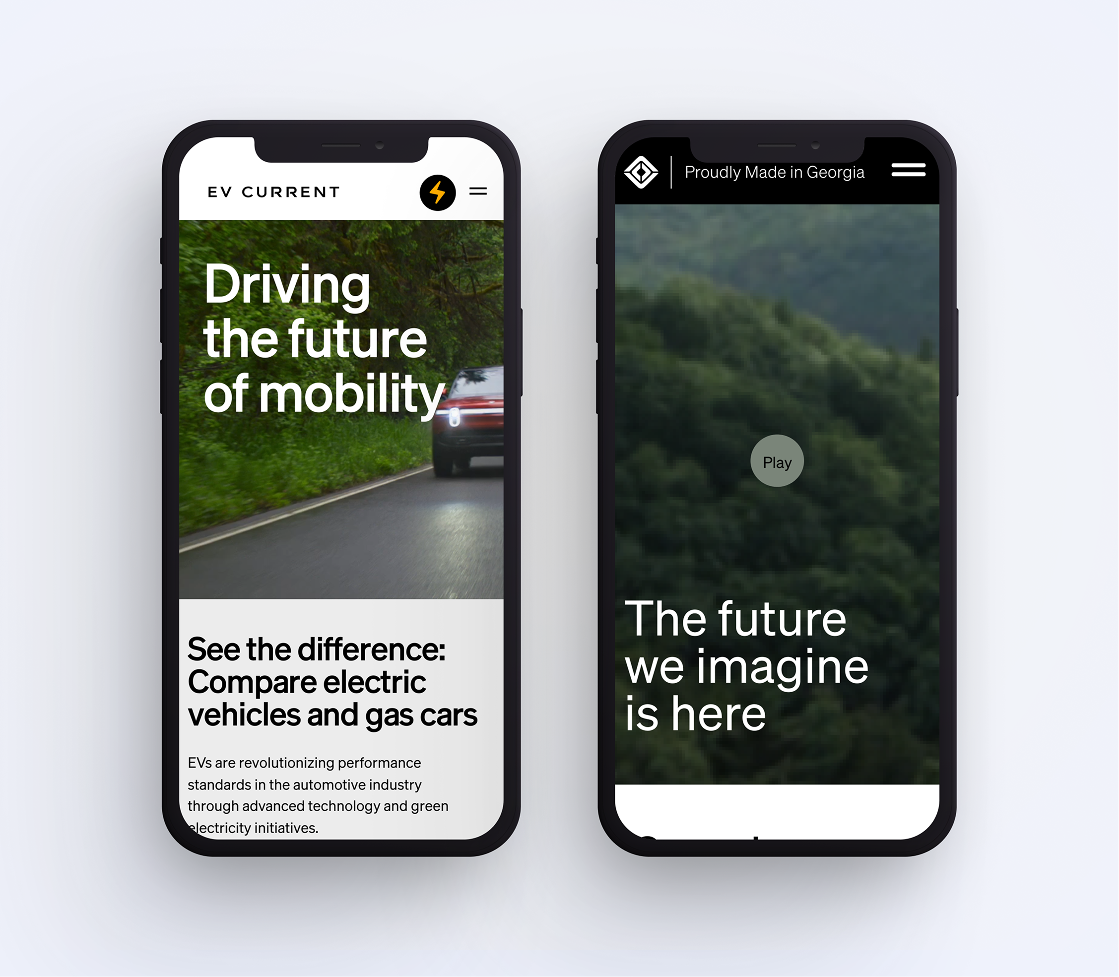
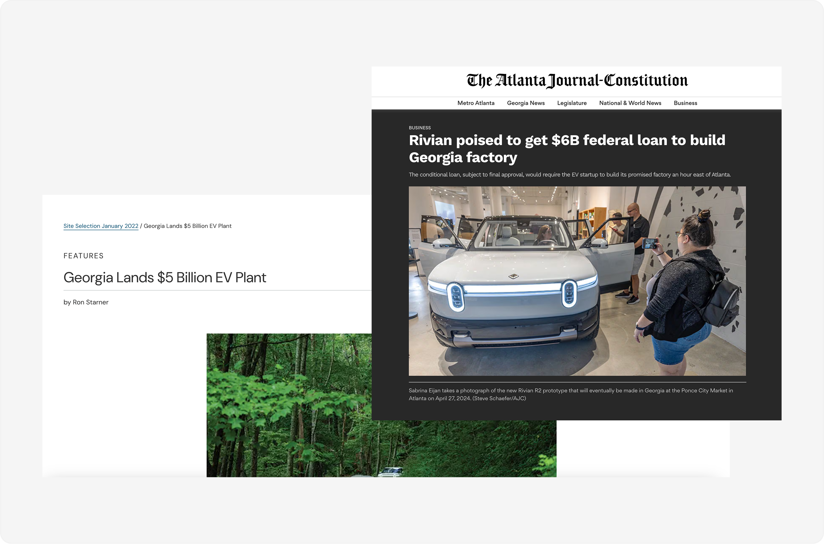
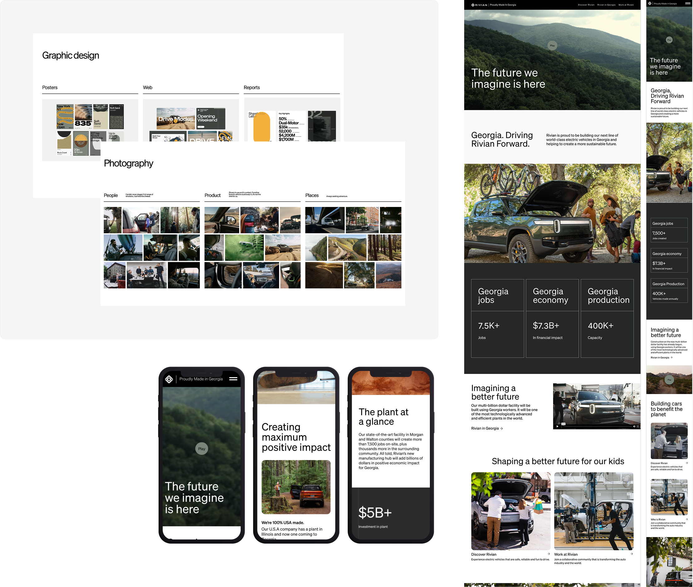
My work with Rivian focused on designing digital experiences around EV education and community engagement. One project centered around “Proudly Made in Georgia,” a campaign experience highlighting Rivian’s future manufacturing presence and regional impact through thoughtful storytelling and visual design. Under the same engagement, I also contributed to UncoverEVs, an educational platform designed to help consumers and policymakers better understand electric vehicles through scalable content organization and information architecture.
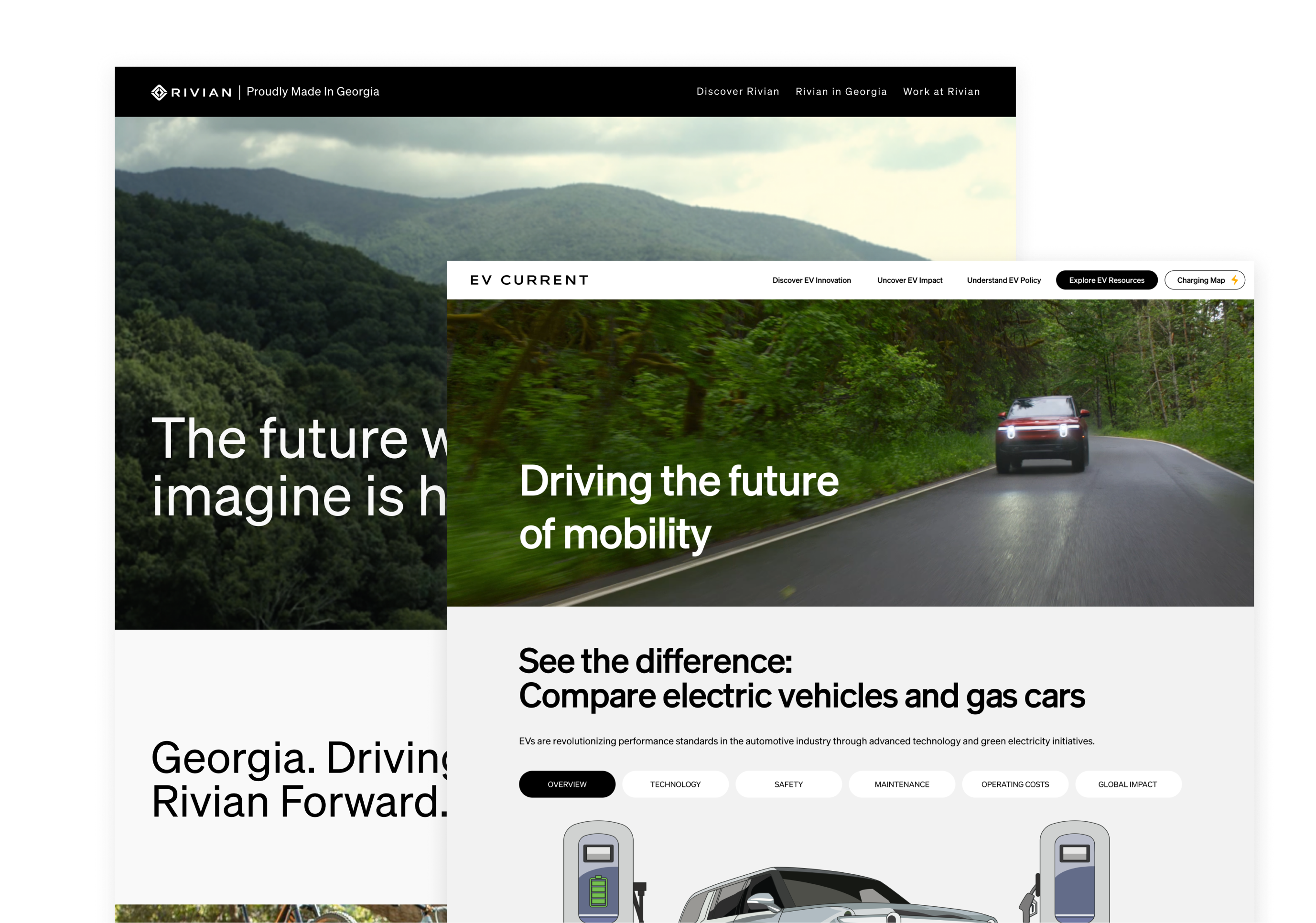
As an electric vehicle company entering a rural Georgia community, a major focus of the project was helping communicate Rivian’s positive local impact while making information around EVs feel more approachable and accessible to broader audiences. The work combined responsive web design, content strategy, and interactive experiences to create a more engaging way for users to explore Rivian’s investment, environmental initiatives, and long-term vision for the region.
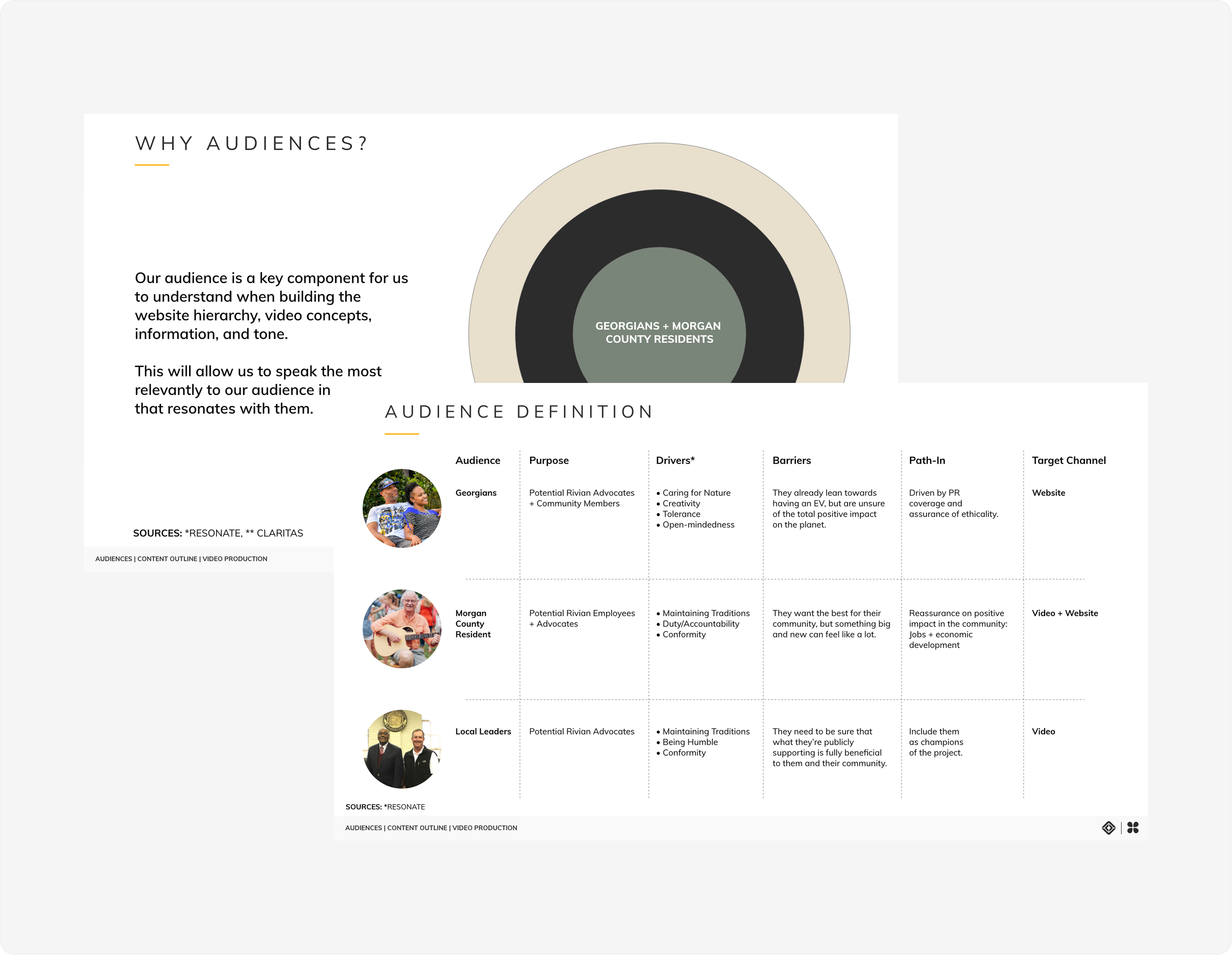
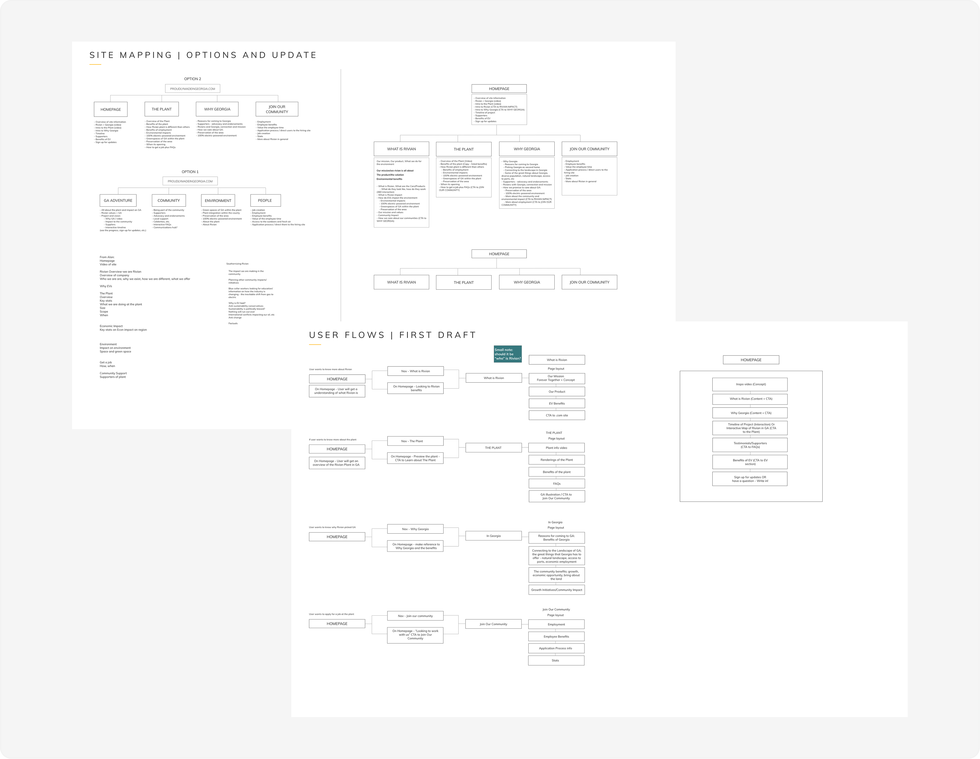
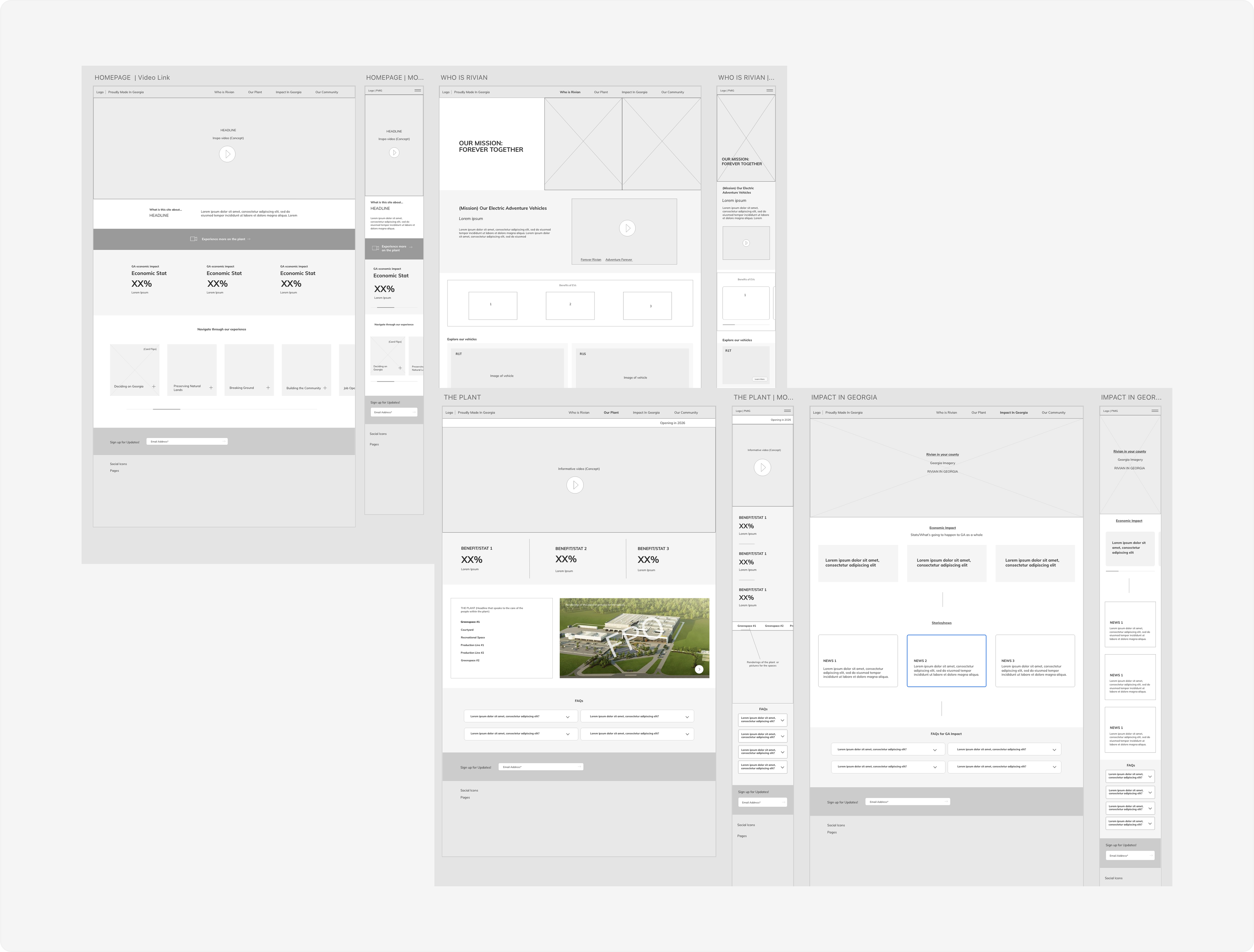
This work included user research, audience definition, site mapping, user flows, wireframing, and visual design across the full experience. The project was ultimately built in Squarespace, where I also contributed to establishing design systems, reusable patterns, and visual standards to support consistency throughout the site.
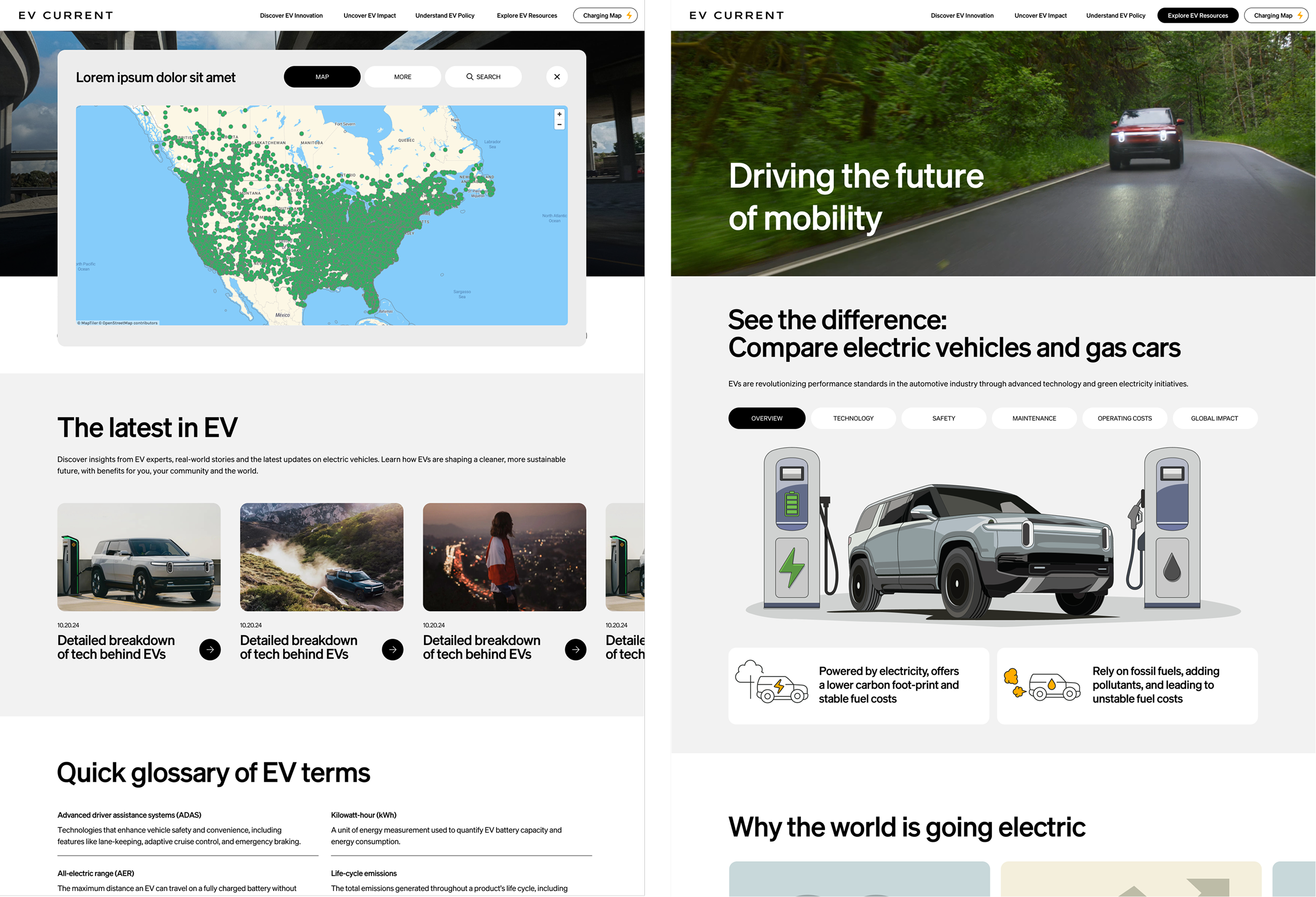
As a secondary experience to Proudly Made in Georgia, Rivian partnered with our team to create UncoverEVs — an informational platform focused on EV education, insights, and public resources. The experience included charging maps, interactive tools, glossaries, and content-driven experiences designed to help consumers and policymakers better understand electric vehicles through clearer, easier-to-navigate digital experiences.
User Research, Information Architecture, Visual Design

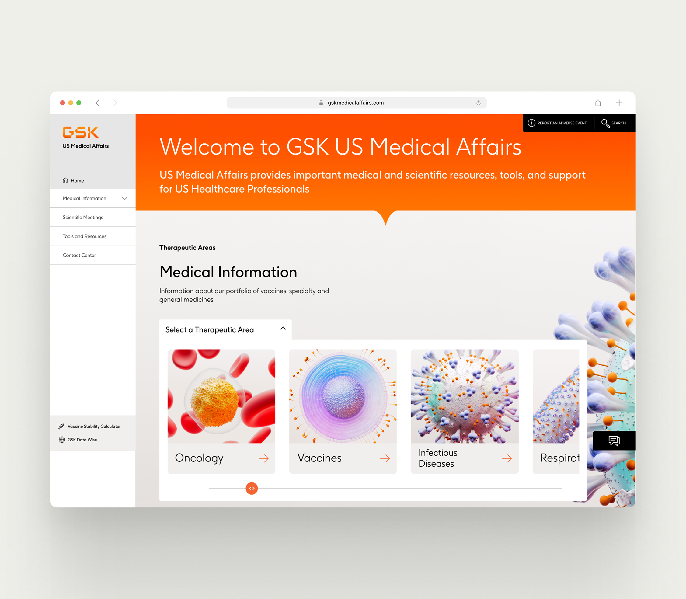
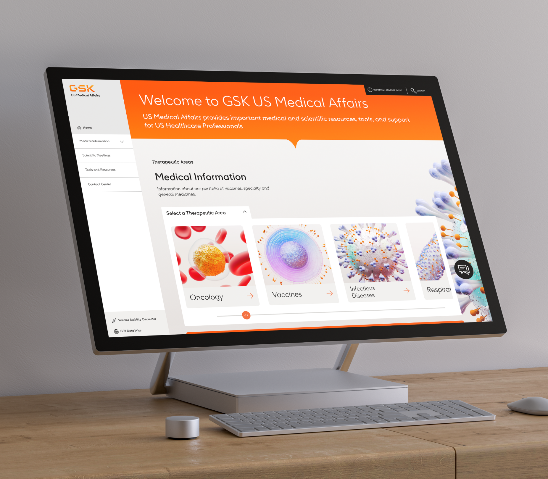
Following previous work completed for ViiV Medical Affairs, GSK Medical Affairs focused on redesigning and restructuring a large-scale platform used by medical professionals to access research, resources, and pharmaceutical information. The project centered around improving usability, simplifying complex information architecture, and creating a more scalable digital experience across a content-heavy ecosystem.
The work included user research, stakeholder collaboration, site mapping, wireframing, user testing, and responsive visual design across the full platform experience. Working closely with medical professionals and internal teams, the project focused on making dense healthcare information and workflows feel clearer, more intuitive, and easier to navigate across the platform.
As a lead designer on the project, I also supported months of developer collaboration to help ensure the experience translated accurately through implementation. Note: The platform design has since evolved since the original redesign.
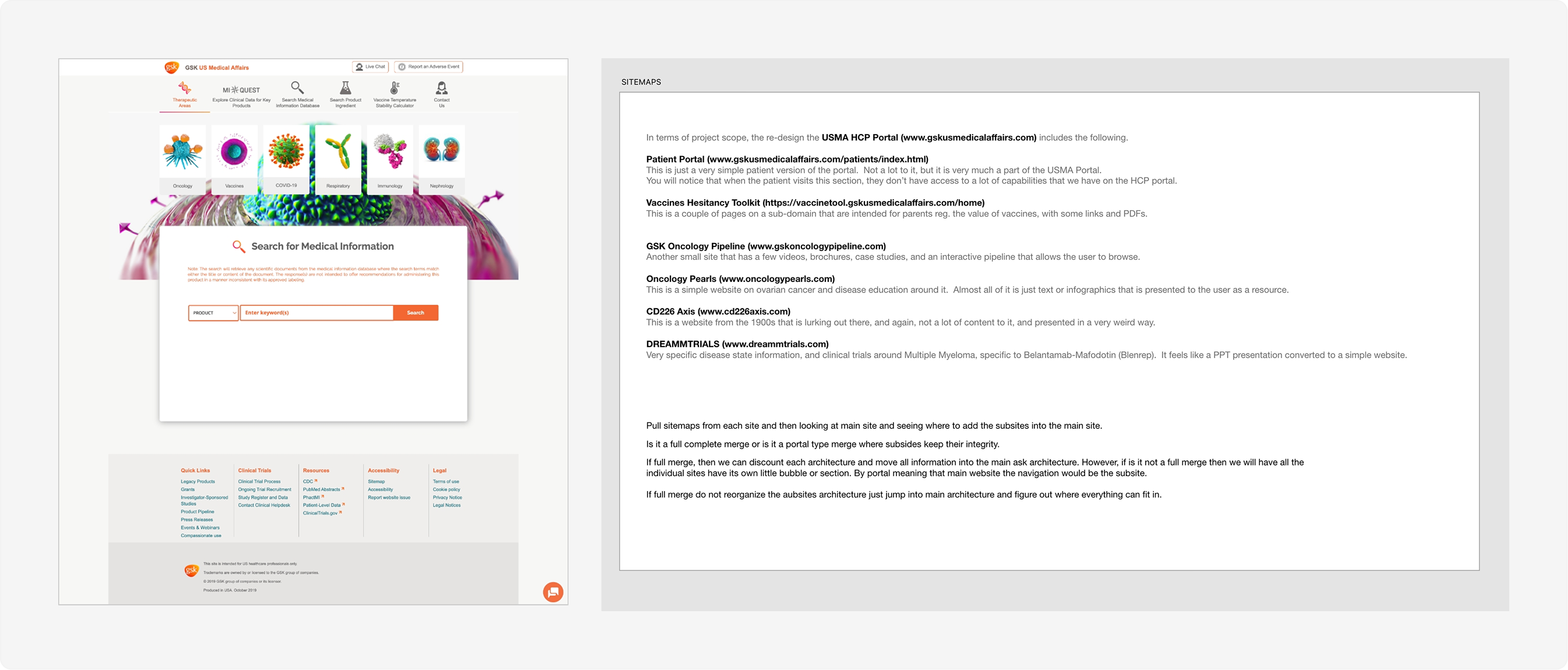
Before beginning the redesign, a major focus of the project was understanding the existing platform, its users, and the complexity of the broader medical affairs ecosystem. GSK had a number of microsites that we needed to accomodate for and integrate into the main experience. The architecture of the previous site was confusing and disorganized, making it difficult for users to navigate and quickly access research materials.
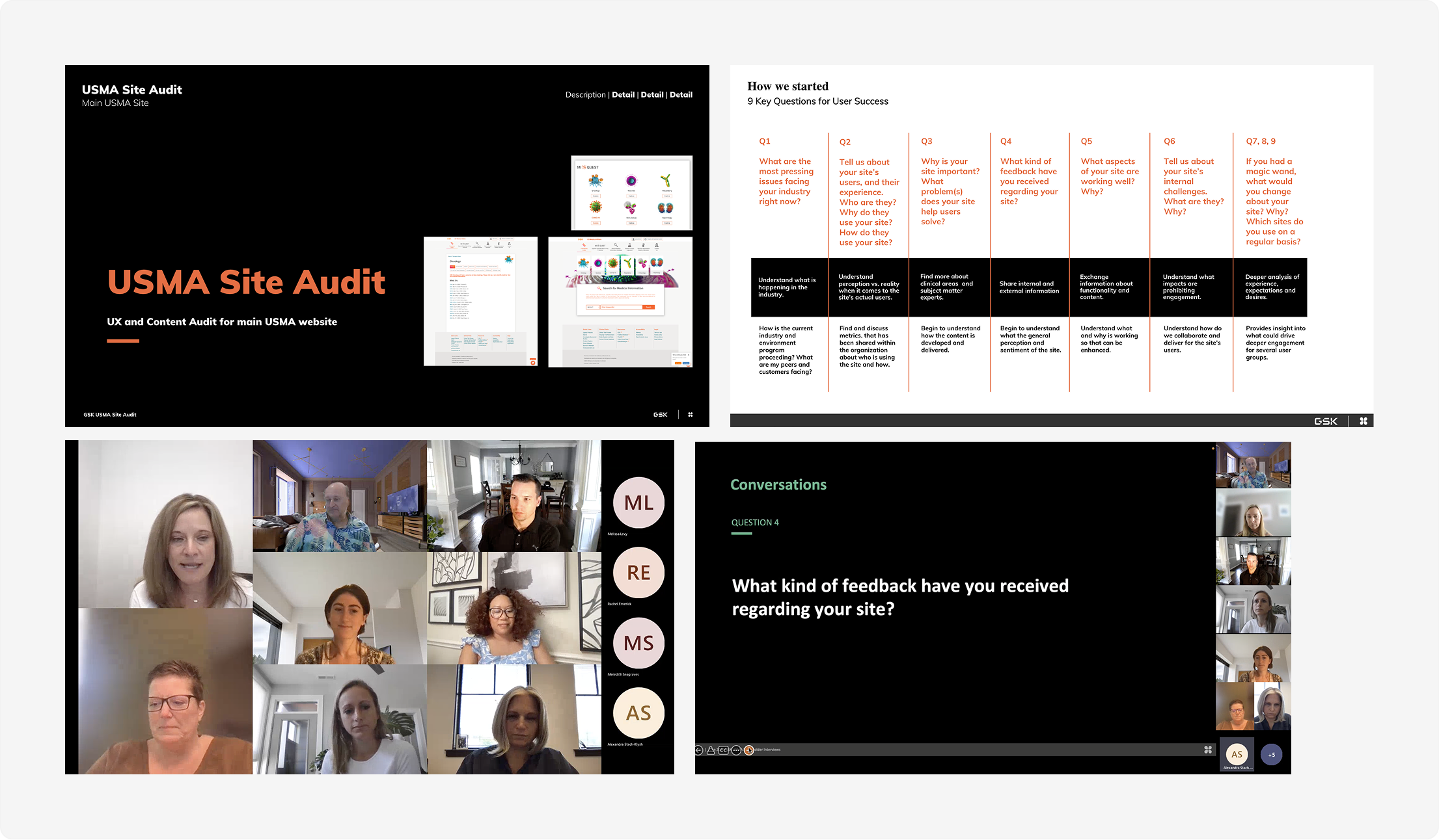
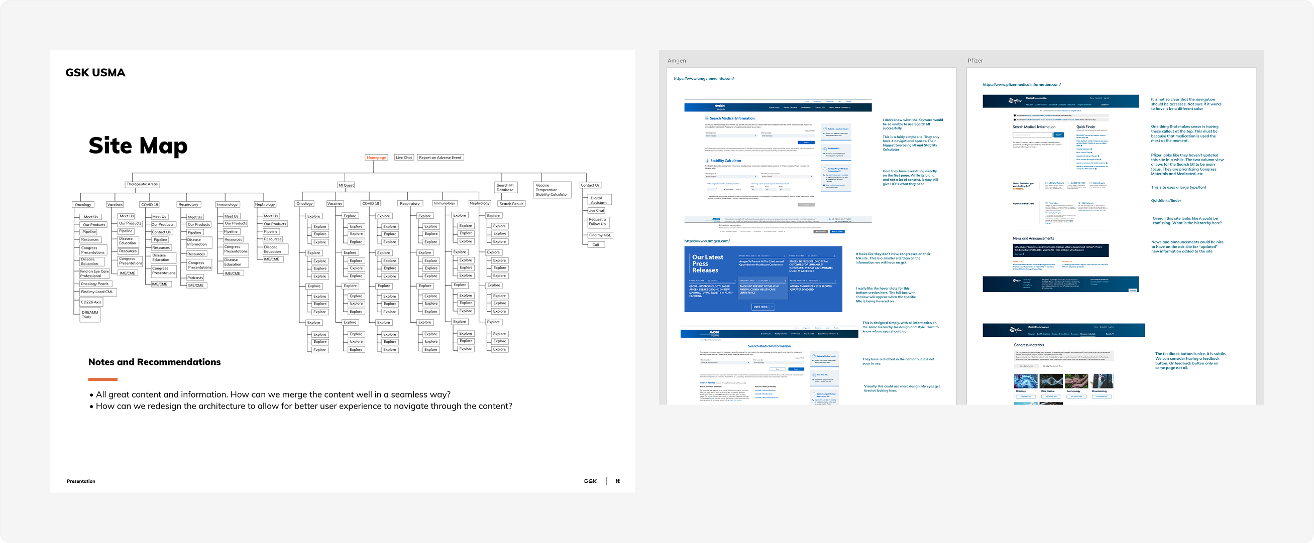
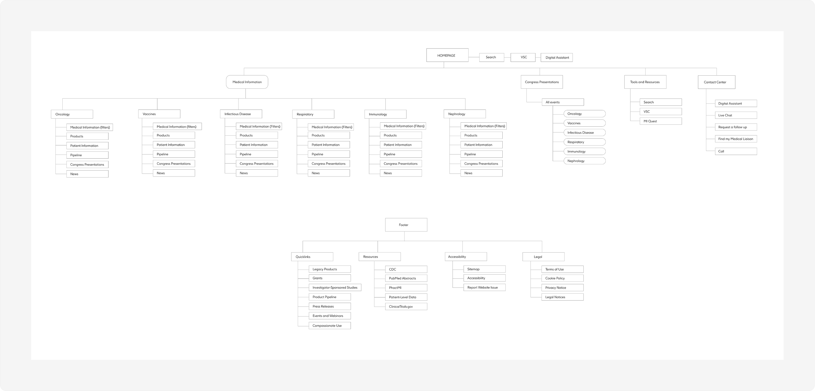
To better define the problem space, the work included stakeholder collaboration, user interviews, user personas, competitive research analysis, and rework of the information architecture.
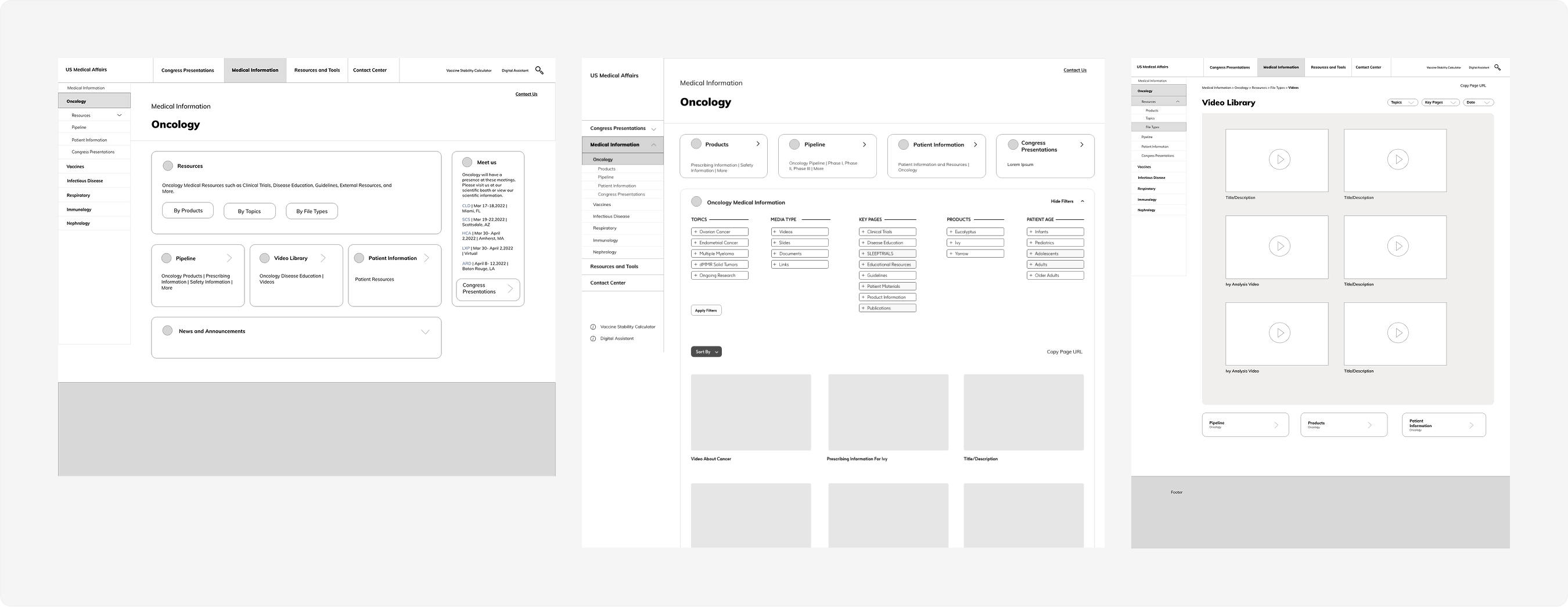
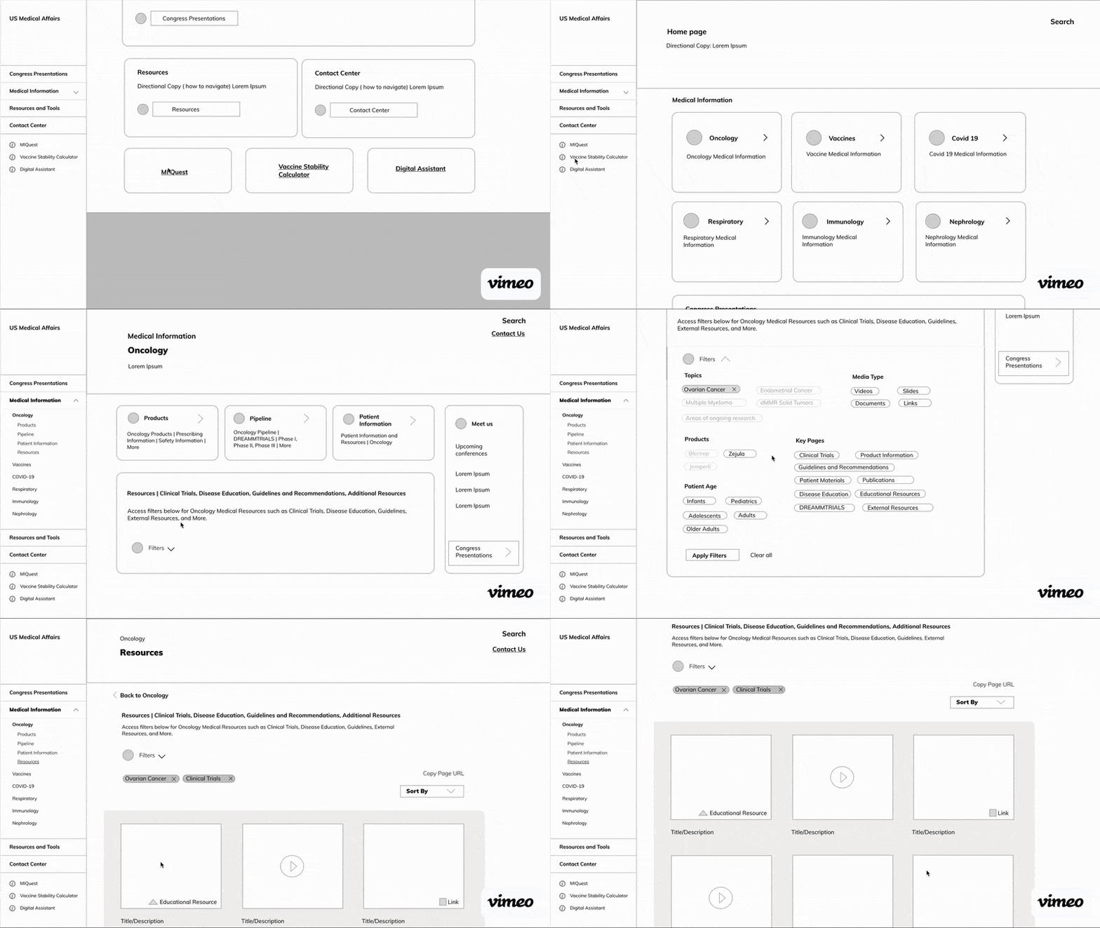
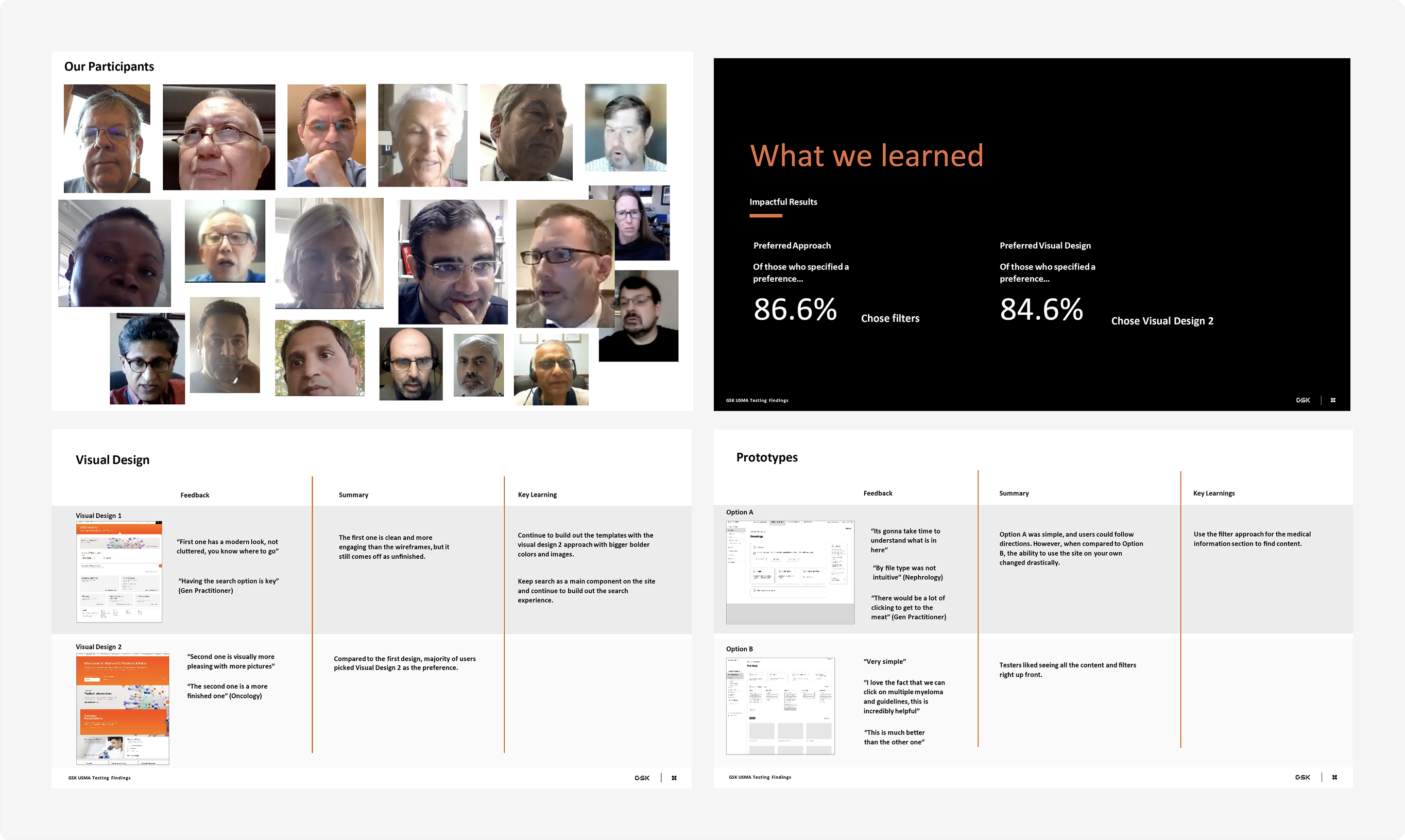
Following the initial architecture and research phase, the project moved into iterative wireframing, visual exploration, and usability testing to refine the overall experience. Multiple design directions were developed and reviewed collaboratively with stakeholders and users, helping validate key interactions, improve navigation patterns, and guide the platform toward a more intuitive and scalable final solution.
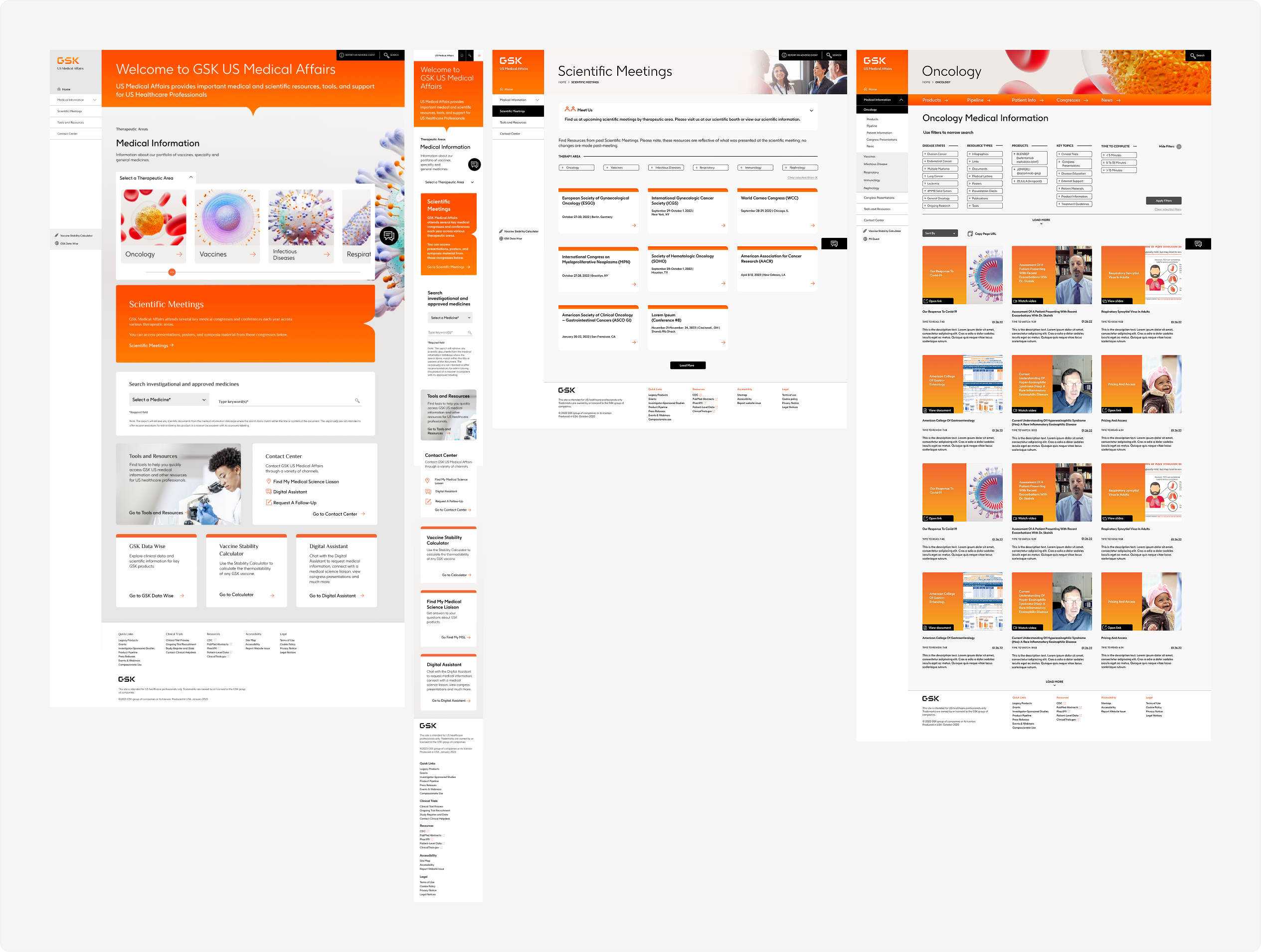
Following the design and testing phase, the project moved into long-term developer collaboration and implementation support to help ensure the experience translated accurately across the platform. This included ongoing design reviews, iterative refinements, and revisiting components as new technical considerations and usability needs surfaced throughout development.
My path here hasn’t been linear, but every step shaped how I think and design. From studying sociology and linguistics to finding a design passion to leading product design work for complex platforms, I’ve always been drawn to systems, stories, and the people behind them. This portfolio is a reflection of the experiences that taught me how to ask better questions, collaborate, design, create, and build with purpose.